5 Responsive eBay Listing Template to boost Mobile Sales!

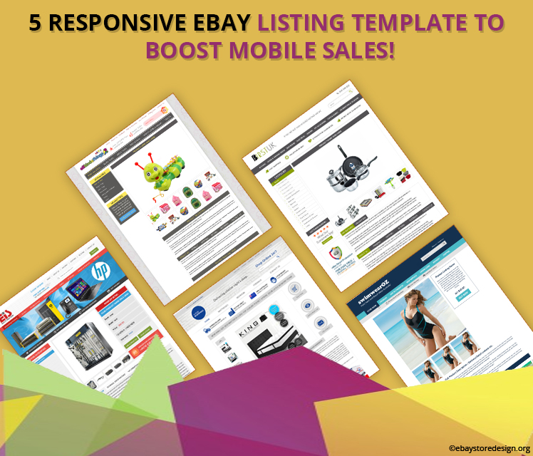
We all know the importance of mobile responsive eBay designs in today’s eCommerce industry. In order to over the competition & provide our eBay sellers with a second medium to sell we present 5 super fabulous responsive eBay listing template designs that we crafted for our clients recently.

In this blog we have integrated all those 5 store links so that you can access them on any gadgets. Be it a laptop, desktop, tablet or a smartphone.

9 Benefits of our Responsive & Professional eBay Listing Templates:

  1. Modern Layout for smartphones
  2. Fastest Loading time
  3. Friendly Design with mobile screen
  4. Compatible with any device
  5. Cross Promotion Benefits
  6. High readability on mobile devices
  7. No Zooming
  8. Touch friendly Image Gallery
  9. No additional Apps required

Responsive eBay Listing Template

Below we have listed the links of 5 mobile eBay stores. It is advised that kindly access them on smartphone devices to get optimum result.

#1 Store Name: All Kinda Things

Click here to see the store LIVE! http://www.ebay.com/itm/-/172107153111

#2 Store Name: BFIRST UK

Click here to see the store LIVE! http://www.ebay.com/itm/-/172104813412

#3 Store Name: EURO IT SOLUTION

Click here to see the store LIVE! http://www.ebay.com/itm/-/172105885790

#4 Store Name: Mobile Mattress

Click here to see the store LIVE! http://www.ebay.com/itm/-/172115665360

#5 Store Name: Swim Wear OZ

Click here to see the store LIVE! http://www.ebay.com/itm/-/172112842760

Get FREE quote today for a super fantastic eBay mobile responsive eBay listing template.

This information was brought to your knowledge by ebaystoredesign.org team dealing in wide array of online marketing & designing solutions. Contact us to get custom eBay store designs and mobile responsive listing template for rock solid sales on eBay.

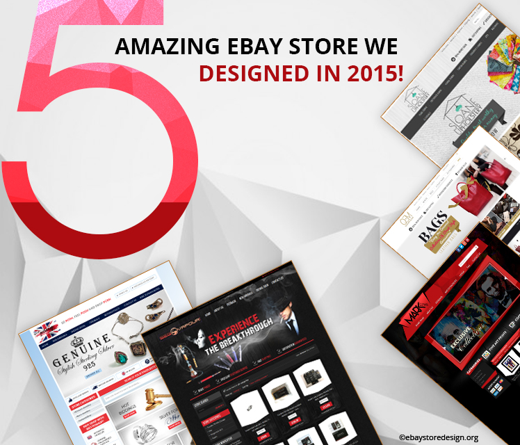
5 Amazing eBay Stores that we designed in 2015! Take a look you might have missed it

We did a lot of excellent designing works in 2015 & that you probably missed out. Well, if you have missed them here is a chance to get along with them once again. See what we have done for our clients in terms of store designs.

When it comes to excellence, we deliver it with utmost efforts. Read the list below to see for yourself all those beautiful & intelligent eBay stores.

#SEG-Vapour

Smoke is in the air. A fantastic blend of mesmerizing colors only RED & BLACK. Highly pitched store header, footer, logo & product areas. Buyers don’t get distracted from the store & stays for a long time on your pages.

Click here to see this store LIVE http://stores.ebay.co.uk/SEG-Vapour

#Brit-PoSHop

A beautiful & custom eBay store design with lots of white space integrated in the design. The store theme is typically a British theme with a combination of red, white & blue colors.

Click here to see this store LIVE http://stores.ebay.co.uk/Brit-PoSHop#

Custom eBay store design

#Mark-Lewis-Art

One of the best & most applauded custom eBay store of 2015. This angular design with a splash of red & black color makes it more exquisite. NO words. Just check yourself.

Click here to see this store LIVE http://stores.ebay.com/Mark-Lewis-Art

#Queens Mark Leather Store

A truly feminine eBay store for all fashionistas out there online. A Sleek left category panel, intriguing product area, banner, logo, texts, menu bar & what not. No words to describe, see for yourself.

Click here to see this store LIVE http://stores.ebay.com/QUEENS-MARK-LEATHER-STORE

#Sloane Upholstery

Just like Queens Mark leather store, our client Sloane upholstery engaged a full responsive & custom eBay store design. Below the banner product category with image helps buyers to select & shop their desired products.

Click here to see this store LIVE http://stores.ebay.co.uk/discount-fabric-furniture

If you are looking for a sleek & serene eBay store design then we have the best one for you.

Contact eBayStoreDesign today for a brand new eBay store & listing combo!

You can browse our portfolio to see out latest designing milestones for some of our esteemed clients. Don’t forget to find us on facebook & twitter.

You can also follow our blog to stay updated on latest store designing trends.

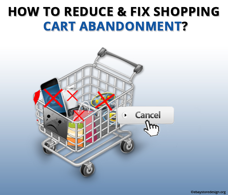
How to Reduce & Fix Shopping cart Abandonment?

Shopping cart abandonment in simple terms means that your buyer has dropped from purchasing your product for unknown reasons.

Well, what are these unknown reasons & how to fix them? Let’s see.

In this blog, you will read about some interesting statistics of cart abandonment & tips on reducing it. Let us get started.

The ratio of shopping cart abandonment for online sellers is 65% to 80%!

Magento ecommerce solutions

First-hand reasons for why buyers abandon shopping cart:

  • Sellers lay hidden price in the final check out process
  • Sellers think that he/she is a serious buyer, but he/she was just browsing your pages
  • The check out process is lengthy & complex
  • Buyers don’t have credit cards
  • They are willing to buy but don’t get enough options to pay.
  • NO discounts are offered………& so on.

Hence to decrease the shopping cart abandon rate you need to focus on refurbishing the checkout process. Below there are certain provisions by which you can improve your check out process.

Your eCommerce site must be Responsive

A responsive site will shed negative user experience for your buyers, it will have smooth navigation, the images will be clearly displayed, and over all the buyer will feel secured while shopping from your site.

Do this on your eCommerce website

Limit your checkout process with only 5 steps & not more than that. If possible number the checkout process steps so that progress of the same is monitored by buyers.

Give multi-payment options

Along with credit card & PayPal options provide your buyers with alternate payment options like bank transfers, cheques, western union money transfer etc. this must be comfortable for sellers too.

Guest Checkout

Everyone is tired of sign up processes online hence provide them to purchase the product without any kind of registration. Guest checkout is the best option.

Do this on your eCommerce website…again

Keep user interface easy by allowing buyers to modify their orders. Check the load speed of your site pages. If they are slow, update them with high-speed load time immediately.

Reinstate buyers trust by…..

Product Reviews & Ratings

Displaying feedbacks on website

Writing original product price

Not taking hidden charges at the time of checkout

Integrating healthy Return & refund policy

This way you can significantly reduce the shopping cart abandonment rates.

Finally have your eCommerce website designed by professionals because they know what is going to work & what not. If you are planning for the same do contact us.

Request a FREE quote for any kind of Magento eCommerce solutions from our expert team of Magento website developers.

Why Brit-PoSHop Chose us to Design their eBay Store? (And See what we did for them)

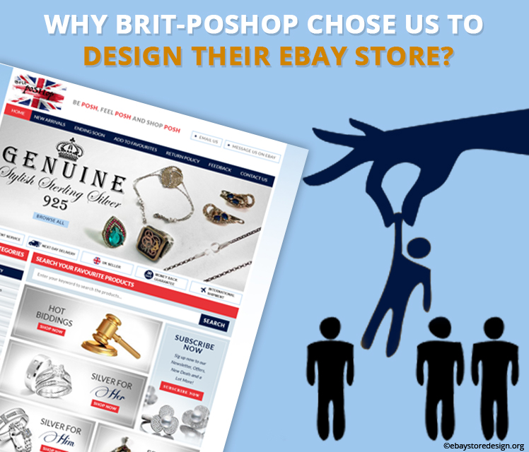
Brit-PoSHop deals in stylish sterling silver jewelry & was planning to get an unmatched eBay store design. Well, they could get the same with other designers too, but the why we?

Let’s check the reasons why Brit-PoSHop opted for us leaving the entire bandwagon of online store designers to design their eBay store.

You can go with ebaystoredesign.org for these reasons:

  • Fleet of Experienced eBay store designers
  • Unmatched & out of box designs
  • Rich portfolio showcasing our current work
  • Budget friendly quotes
  • Truly responsive designs
  • World class support services
  • And many more things that are enough to opt for our services.

Custom eBay auction template

Our clients go with our designs, but what exactly we do that tempts our client to select us & not others. Let read.

The design

This particular design is crafted in British themed using red & white colors with navy blue splash all over it. As the seller is UK based.

The header section includes banner image with trust tags like Excellent Service, Next Day Delivery, UK Seller, Money Back Guarantee and International shipment.

The tagline

Above the banner image a solid tagline is added that says BE POSH, FEEL POSH AND SHOP POSH giving a rich feel to the buyer. All this collectively attracts buyers to the shop.

Left panel

Clickable store category is featuring only four items & that saves a lot of time of the buyer searching for products.

Why shop with Brit-PoSHop? is another reason for buyers to trust the seller. All these statements with icons are engineered to elevate the credibility of the seller.

In the main section

Instead of starting with product image description and price, we did something different. Our designer highlighted this area with HD image, attractive graphics & beautiful color theme. The result is we got “Hot biddings, Silver for him, silver for her & Featured silver”. Upon mouse over the image zoom for a click. A small red CTA button with “Shop Now” text helps buyers as to go where.

CTA button must serve the purpose of helping the buyers to move forward, the same we have done in this design.

A lot of white space is left so that the main product gets more highlight & not the design. This is also a reason for our client to go with our designs. We focus on the product so that seller gets more clicks.

We know we are best in designing and that we don’t need to show again and again in any client design.

If you are happy with this design we can make for you too. You can contact us for a similar one or more eccentric eBay shop with listing design.

Get FREE quotes on Custom eBay auction template!

Like us on Facebook, follow us on Twitter & Pinterest, Check out our google+ page. Along with good designs we also deliver informative blogs. Don’t forget to read them. You will enjoy it!

10 Reasons to Select Magento eCommerce for Online Business

Selecting the right ecommerce platform for an online business is a tough job, not because so many of them are available but all of them offers immensely excellent services & promises to take your online business to the next level in real sense.

In this blog today we will focus on one of the well-touted & widely used ecommerce platform called Magento. We aim to educate those who are not aware of magento with the help of this blog.

Here are ten of the biggest advantages of Magento:

#1 Versatility

It offers versatile content management system to the user with a visual page editor to create and customize their own Magento ecommerce website.

#2 Mobile Friendly

Magento designs are responsive to load & fit any screen size. Not only mobile but also desktop, laptops, tabs, etc.

#3 Spacious

Magento supports more than half a million products & 80000 orders per hour.

Magento ecommerce web design

#4 SEO optimized

It is inbuilt with powerful SEO features giving enough exposures to sellers to rank on search engines. 

#5 Third Party Integration

It can be easily connected with eBay, PayPal, google shopping etc. moreover it supports all third parties listing software.

#6 Up Sells & Cross Sells

It offers a good chance to browse related options on products & checkout processes. This way it increases selling. 

#7 Biggest Community

More than 250,000 sellers including big companies & individuals use magento ecommerce web design to craft beautiful online shopping platforms. It also accumulates more than 500,000 developers worldwide.

#8 Security

The important reason behind magento being most popular is their security concerns. With customized level of security arrangements you are 100% safe online. 

#9 Intelligent Searches with Filters

Magento enables users to search with auto suggested terms, product tag filters and product reviews.

#10 Extensions & plugins Library

Save your Time & Money by using extensions & plugins developed by community members worldwide.

With the end of the list we would like to advise you that if you are planning to go with online selling then magento is the ultimate solution for you. Get on this amazing eCommerce ride with us.

Request a FREE quote from our expert team on Magento eCommerce web design.

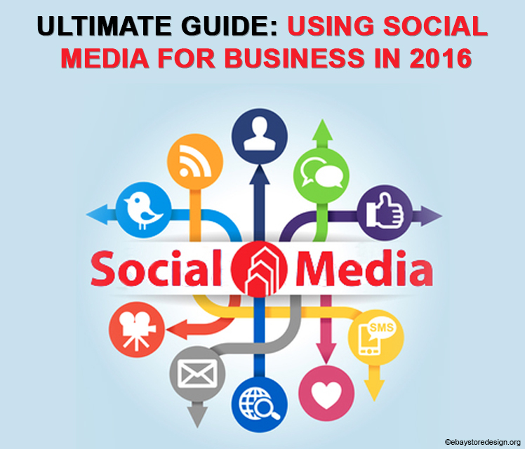
Ultimate Guide: Using Social Media for Business in 2016

We are confused – what social media platform we should go with? They are growing with time & technology. Online business is a screaming opportunity, but it should be intelligently handled. In this blog we have mentioned HOW, WHEN, WHERE social media is used to promote your business online.

Even the WHO’s WHO of online sales is using them to benefit their business. With traditional methods of marketing you cannot withstand the toughest online competition. For that you need to use a tangible & proven platform so that your credibility & buyers are retained.

Let’s read this excellent blog. We will start with the benefits of social media. They are used to:

  • Increase sales
  • Cut down marketing cost
  • Increase business partnership
  • Generate organic leads
  • Improve rankings in search engines
  • Generate traffic on websites or online stores
  • Increase honest buyers

And the list goes on every year.

Ultimate Guide Using Social Media for Business in 2016

Interesting statistics of top social media platforms:

Facebook

More than 1.40 billion active monthly users

Twitter

More than 290 million active monthly users

LinkedIn

More than 190 million active monthly users

Youtube

More than 1.20 billion active monthly users

Google+

More than 545 million active monthly users

Instagram

More than 205 million active monthly users

Apart from those mentioned above there are other social media platforms like Tumblr & Pinterest with fair enough share of active monthly users. Now, looking at the jaw dropping figures you cannot risk avoiding them.

Social Media Advertisements:

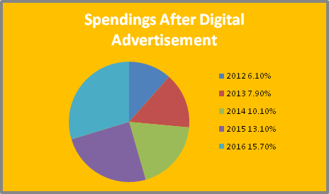
Facebook dominates the digital ad world which includes images, videos, apps, games etc. and this year the social media digital marketing will see a 15.7% of share in total advertisement spending.

Digital advertisements

Big Challenges that seller come across on Social Media:

  • 50% of sellers find social media is not bringing enough return on their investments
  • 30% Sellers don’t have time to market their products or services on social media
  • 35% are going nowhere. They don’t have planned strategies.
  • 20% don’t know how to use social media
  • 18% says “They have budget problem” (They actually think, social media will take away their accumulated fortune)

List of contents that can be used on distinct social media platforms:

  • Organic written Contents like blogs, articles, news editorials etc.
  • Visual contents like Images, infographic, graphics, charts, graphs etc.
  • Audio contents like podcast (should be short in length)
  • Original videos of products or services
  • PowerPoint presentations

Tips on using Social Media effectively & effortlessly:

  • Keep track of your social platform & the activities that you do through them
  • Write off social media that are not performing for you
  • Hire an educated & professional team to do the job
  • Share all types of contents. Don’t leave any stone unturned.
  • Customize all your contents before posting them
  • Let everybody know that you are using social media
  • Cross promote all platforms with each other.
  • Don’t do copy paste others work or content

Well, after reading this blog you can decide which social media platform is best for your business and how you will perform on them this year.

We, at eBaystoredesign.org continuously provide our readers useful information in easy & understandable language so that they can read and follow them.

If you are planning to market your business on these social media platforms then contact us. We can represent you in the best way. Along with unmatched social media designs we also deliver excellent eBay store design services that include custom eBay store design & custom eBay listing solutions.

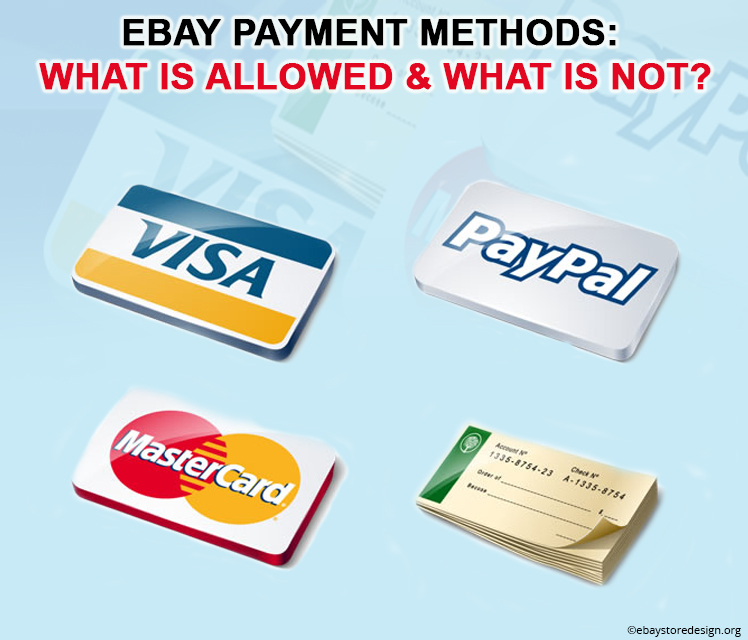
eBay Payment Methods: What is allowed & What is not?

eBay follows stringent payment policies both for sellers & buyers. That is why it is the most successful & preferred online selling & buying platform compared to others.

Today in this blog we will see what kind of payment methods eBay practice. What eBay allows? & what is that eBay don’t allow? Let’s take a look:

The eBay Payment Policy

eBay gives convenient payment options to both buyers and sellers with its payments policy. Being a seller on eBay the security of your payment is of utmost importance. Hence using eBay approved methods of payment guarantees safety of money.

eBay store design solutions

The eBay Payment Guidelines

What is allowed?

eBay allows PayPal, PayPal credit, credit card or debit card payments through sellers account, and payment upon pickup.

The security measures of eBay are very strict & this happens to know in this way that it allows buyers to store their card in their eBay account. And also they can remove the same anytime. Now, that’s Amazing!

What is NOT allowed?

Direct bank transfers in the form of cash aka bank wire transfers, Checks, Postal money orders, and other online payment services.

Certain categories are exempted by eBay to follow unconventional payment tools like those stated above.

What is Restricted?

eBay strictly restricts sending cash through mail, money orders, non-banking cash transfers through Western Union, Money-Gram or others.

Sending checks through mails, bank-to-bank cash transfers, making payments through payment methods that are not specified by eBay.

eBay also restricts asking buyers for any other payment methods than the standard ones.

If these are done then you may face account termination or limitations on your selling rights.

Hence, before you start selling on eBay we advise you to consult our experts. They will guide you through the procedure.

You can also consult us for beautiful eBay shop design that is crafted for attracting buyers and capable of converting leads into real time buyers.

Contact us & get FREE quotes on wide array of eBay store design solutions that we offer.

How to Handle International Returns with Minimum Loss?

Reverse sales or reverse logistics are fancy terms to portray potential loss when the goods are returned by your buyers. It is obvious you are going to incur loss, but with the help of tips mentioned here you can minimize it to some extent.

Let’s read how to handle international returns & bear minimum damage.

1) Give away product for Free instead of getting it back.

If your product sold is of low value & additional cost like paying for return shipping is more than giving away the product is the best way. Many sellers just give full refund without even asking for returning the product/s. the buyer will be delighted to get a product for FREE of cost.

Do this for only low value products.

2) Use economic parcel services

If the product/s is of high volume accumulate all the return goods from buyer/s at a single place in that particular region. Use an economic forwarding service to get these products back to you. This type of forwarding services charge less. You can cut off a maximum amount on returns.

If product value is very low, follow point 1.

eBay Listing Template Design

3) Use International Carriers for Return goods Job

There are massive logistics companies like DHL, TNT, FedEx and UPS to ship products, if they cannot return your parcel back to you in less expense than there is nobody to do the job. Use national postal services of the region where you have sold the product in order to get it back easily.

For more details see UK’s Royal Mail online postage shop & Germany’s Deutsche Post.

4) Use Local Warehouse

With fast growing eCommerce industry eCommerce giants like eBay, Amazon, Flipkart have provided sellers with local warehousing facility for product forwarding services to both buyers & sellers. They operate on numerous locations by charging less to sellers. Just go through their terms & condition for more details.

The biggest advantage of eBay, Amazon, Flipkart offering international returns service is the lowest shipping costs. They ship in bulk quantity.

5) Resell the return products in local market

You can list the local item on your eBay listing template with a return tag & additional discounts or hire local warehouse operators to sell the return product/s then & there without shipping the product to you.

International sales is a thoughtful idea even for small sellers if handled carefully otherwise it can draw a major financial setback. The same is with big sellers. The only difference between them is they have enough cash to bear the damage.

With these solutions we leave you to decide what you shall opt for when you have a situation of international returns. Don’t mind taking experts help in such cases. A small fee or charge will help you a lot. You can contact us too.

We are engaged in designing stores & listing templates for eBay that assures a minimum of returns. Contact us & we will explain you how this works.

Get in touch with our experts for FREE quotes on eBay listing template design or just drop your contact details.

25 Steps To a Killer Logo Design! (We hope you end up with a great LOGO)

Logo is what your business all about it reflects your credibility & identity online & offline both. Have you imagined why super successful business brands are actually into that position. The game is of recognition. The more memorable you are the more buyers get attracted when they see your products or services.

But wait what recognize them of you when they see your products or services? It’s the logo! Yes logo does it all for you. We all know what a logo can do while branding.

Today we have pinned 25 tips that will help you to design a logo that will not only be memorable but will also groom the brand online.

“Create something that is different, that you believe in, that is not out there anywhere”
eBay Logo Design

Follow these 25 steps that will head you towards stunning logo design. Here we go.

1) Don’t use Shortcuts

Avoid ready-made templates or ready to use logo designs. You will have to make numerous changes later. They are neither cheap nor they save time.

2) Have Patience

Logo designing can be a frustrating task instead of being fun. That’s why have patience & stick to what you are doing.

3) Avoid stereotype formula

Don’t go behind concepts that are overused, you will get a lot of new things online. Search for it.

4) Personality

A good logo depicts serious persona of your product or services on buyers. If this idea is not conveyed it could end up in a mess.

5) Not necessary to define exactly everything

Logo should be interesting, it is not important to exactly portray everything about products or services in a logo. You can go beyond this.

6) Don’t Copy Paste

If you come across a good logo doesn’t mean you are entitled to use it for yourself. Remember it’s someone else hard work & creativity.

7) If you like, others will like

That’s not true everytime, your likes & dislikes are at par, it is your audience who decides whether it’s good or not. Give it a test run.

8) They don’t have whole day

It takes few seconds to scan everything from logo to content online. Hence you have fraction of seconds to attract viewers.

9) Keep it Simple Silly!

Nobody remembers complex things. Make it simple & easy to memorize.

10) Logo size

It is not implied that large logos will work & the same is with small ones. The logo size must be recognizable. Pixels must be limited for extra details.

11) Fonts

Avoid using more than 2 fonts at a time. You are designing a logo not a menu.

12) Logo Shape

Keep it horizontal even if you opt for any particular shape. Don’t use distraction elements.

13) Icons

Icons represents the logo idea best, they can be used everywhere & are easy to remember.

14) Logo Taglines

They are good but do not work in small size logos. So use it wisely.

15) Logo colors

Logo colors are not about what is your favourite color but it should be about what your products or services wants to convey to the viewer.

16) Color Selection

Colors speak & that’s true, each color conveys different message they have strong bond with each other.

17) How many colors to use?

We have come across single & multi color logos that are super successful. Colors limited to one or two in a logo is advisable. If you are designing a multi color logo try the same in single color too.

18) Special Effects

They might not work everytime. Special effects are just an eye candy giving pain to the retina if not used properly.

19) Test it from multi dimensions

Test your logo by viewing it from different angles, up & down, sideways just to make sure that it is no different from what you were going to make.

20) Don’t throw away your rough sketches

Yes, if your design is approved don’t throw away the rough sketches. Who knows when your approved logo gets disapproved?

21) Format

Your logo must be in vector format. In vector formats they can be easily edited.

22) Multiple file formats

We advised above to use logo in vector format for easy editing, but also they should be available in different file formats like JPEG, PNG, PSD etc. after all they are going to be used for various online purposes.

23) Never change your logo

If you are bored with it give it a redesign, but don’t change it on the whole provided you have legitimate reasons.

24) Be creative

Yes, be creative, do enough research & developments beforehand. Take reference of famous logos.

25) Never make To-Do list!

Yes, creativity is self inspired it is not an AM to PM Job. Don’t design a logo according to any “LOGO TO – DO LIST”. Not even this one.

If you need a logo design for website or webstore that is truly engaging then contact us. Feel free to get in touch with us for an exclusive 10% OFF on your 1st eBay logo design.

NO templates NO clipart – Only original Logo Designs. Contact us & get FREE quotes.

ebaystoredesign.org also provides terrific eBay shop designs & eBay listing template designs for eBay stores. Just check out our portfolio page.