In this blog you will read a brief story on very basics things that are often overlooked in your eBay store design. If they are well amended then you can increase your conversion rate to a great extent.
Let’s start with what they are & how they can improve your eBay store conversion ratio.
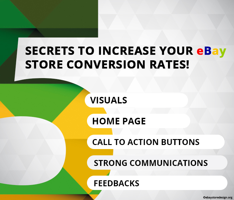
#1 Visuals
Visuals lay a big impact on your buyer’s retina. Visuals include images, design, layout, colors, banners etc. among these things colors play an important part. Read below how they psychologically affect buyer’s mind.
Females prefer blue, purple & green while males prefer blue, green & black. Hence when you do an eBay store design keep these colors in mind.
#2 Home Page
It is the first page of your store that a visitor will visit & you will be glad to know that you have only few seconds to convince them when they are at your store. Buyers at first instance only scan your home page or any other page, they just SCAN they don’t read. So, what’s the deal when they scan?
Your home page along with other pages must be attractive enough. They must be simple but attractive. Text must be concise, describe the benefits of your products instead of features, don’t waste their time or else they will run away quickly.
#3 Call to Action Buttons
The CTA button shall be smart enough to take your buyers to the next step. The CTA buttons are not for decoration purpose they shall actually serve the purpose of helping your buyers to take the right decision.
Place them in the header & footer sections; be specific while designing the CTA buttons. For example buy now, buy it, buy today, get discounts etc can be used.
#4 Strong Communications
Personal interaction with buyers has a good history of increasing sales overtime. Communicate effectively with buyers so that they come to know that they are dealing with real human beings on the other side.
Be clear & precise, keep a smile & be prepared with your conversation material.
#5 Feedbacks
A buyer before purchasing from you will always check for other buyer’s feedbacks, reviews or comments those who have already purchased from you. Reviews serve as personal recommendation to the buyers; hence always ask for feedbacks from your buyers.
If they post negative feedbacks, ask them why they did so. Solve their problems & try to gain positive feedbacks from the same buyer.
All these factors collectively work on buyer’s mind when they decide whether to purchase from you or not? And all these factors shall be integrated creatively in a custom eBay storefront design.
A beautifully crafted store design does a lot for you as a seller. These designs are easy to install, attractive & intelligent enough to generate leads & convert them into buyers.
Get FREE quote for any of our custom design Services.
We deal in a wide variety of innovative online marketing & designing solutions. Contact us or drop your contact details to get interesting info about our services.
eBay is an amazing eCommerce market where sellers can sell any variety of products & that is very true but on the contrary there are certain products that should not be sold on eBay. What happens when you sell such products on eBay? Read below
If you sell products that should not be sold on eBay you may. . . . . . .
- Tarnish your reputation of being an eBay seller
- Lose buyers to whom you sold these products
- Undervalue products & make huge loss…..& so on
So, let’s get on to the list where you will read list of 10 products that should not be sold on eBay. Let’s see what they are.
#1 Common product like Books, Audio/Video CDs or DVDs, Games, Sample Software etc.
It is very simple that selling these items you are not going to earn a fortune. Ask them who are selling them currently. Why your buyer will buy a book or a CD from you when they can easily rent it from any local shop. You also need to invest a massive amount of cash after stocking these items in bulk quantity.
Do you know that average price of these products are less than a pizza or a burger!!!
#2 Grocery Products
These products fall under perishable items category. Are you going to ship a sauce bottle worth $5 by bearing a shipping cost of $10 or $8 to your buyer? Absolutely NO. Then it is better to leave these items to your local grocery stores. Durable products are good to go with.
#3 Used/Unwanted Products
You are planning to sell used or unwanted items on eBay because you don’t need them anymore. Make this very clear don’t use for a junkyard sale. eBay is for serious stuffs and things that are of no use to you then how they can be useful to your buyers.
Used clothes & electronic items are sold more under this category. You should stop doing this.
#4 High Value Products
Products whose cost is immensely high, items that are big in size & shape, products that can create problems in shipping & delivery of the same etc falls under this category. If you are experienced in selling & shipping such items then it is good to go. But if you are planning to do so first gain some experience or do some research works.
High value products gain high return but these products accompanies high shipping freight & cost too.
#5 Intellectual properties
They are protected with copyright laws & eBay is too strict about them. Hence unless & until you are the owner of these intellectual properties, do not deal it with online.
#6 Products with short life span
This category includes healthcare products, antique items that shall be preserved with utmost care, items that contains or coated with harmful chemicals like lead, etc. If you are planning to sell or already selling them do it with strict user manual.
#7 Damaged Products
Sellers tend to show smartness by selling damaged, under qualified or inferior goods at high price to buyers. But this is once in for all. And you will end up shutting your business for lifetime.
#8 Explosive & flammable products
These products in any form are hazardous & shall not be sold online because you never know for what purpose they are bought & will be used.
#9 Alcoholic Beverages
eBay does not permit to sell alcohol online hence even if you tend to do so you cannot.
#10 Narcotic Products
Selling narcotic products online is itself against law & eBay or any other platform doesn’t support the same. You will be tried as per law pertaining to these products if you try to sell them directly or indirectly.
We would end the list here but this list is not absolute. You can refer a full list of prohibited & restricted items by eBay.
Click the link to see the list - http://pages.ebay.com/help/policies/items-ov.html
This information was brought to you by our expert team providing custom eBay listing solutions.
Get a FREE quote for any of our eBay Store Front Design Services.
We at ebaystoredesig.org deal in a wide variety of innovative online marketing & designing solutions. Contact us or drop your contact details to get interesting info about our custom eBay listing solutions.
As you strategize a marketing technique to generate more leads, it becomes vital to pamper those potential leads who might convert into real-time buyers. If you approach 10 buyers there are chances that 1 out of 10 only will buy from you. That means 90% of your leads remain cold or either unconverted or untouched.
What can be done? The answer is to nurture them & you will see a big difference in your sales & that would make upto 50%.
Hence, in this blog we have written a brief introduction on 7 effective lead nurturing strategies that give a great opportunity to sellers like you to gain advantage & overcome competition. Read them below.
1) Targeted content
Nurturing leads with targeted content strategy is to deliver exact content to the exact person at the exact time. To do this first understand your buyer. What is his/her interest or objective to buy your product or service? See how your product/services will benefit him/her. Based on these data you can design your marketing content. This is what you say lead nurturing through targeted content.
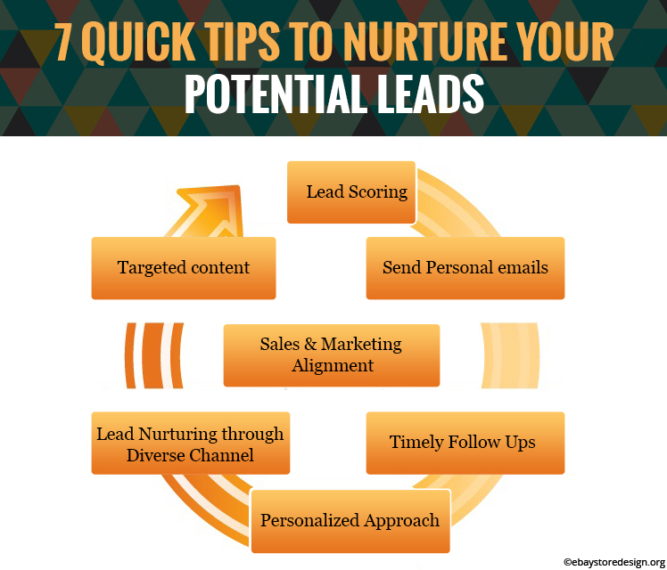
2) Lead Nurturing through Diverse Channel
Gone are the days when email campaign was the only medium to communicate with potential buyers. Now we have the multi-channel technique to do the same. It integrates a combination of sending emails, social media interaction & engagement, highly decorated eBay template design to attract buyers, the stunning landing page of your eBay store design, direct sales etc.
3) Personalized Approach
Lead nurturing technique includes a personal approach towards potential buyer by addressing his/her questions & queries in person. That could be done by any means like phone, email, text messages etc.
Instead of sending your potential buyer a long list of shipping rates, taxes, price etc. send him/her an interactive calculator so that they can calculate the same by themselves.
4) Timely Follow Ups
A scheduled follow-up by an email or a phone call is the best practice to convert a lead into a real-time buyer. When you follow up a lead it shows that you are concerned about the buyer’s requirement. The same is reflected in buyer’s mind too. Hence, do it again & again.
5) Send Personal emails
Personalized emails tend to generate higher revenue compared to generic emails. Being personal is equal to being human. When you show a personal approach to your potential buyer they come to know that they are dealing with real humans and not any automated answering machines.
6) Lead Scoring
Though being an effective nurturing technique only 18% online sellers use it to contribute to their revenue generation. So, what exactly is lead scoring? Let’s understand it.
Lead scoring is a tactic to rank a particular buyer based on his/her level of interaction with your store pages or products they might chose to buy. In simple words, it is used to see what kind of visitor shows a certain level of engagement with pages, links, products, etc on your eBay store.
For this, you need to have an insight of your store pages like Facebook gives you.
7) Sales & Marketing Alignment
Both of them must be cohesive & well aligned to work & contribute towards revenue generation effectively accounting each other for converting a potential buyer into a real one. In short you will have to keep your sales team & marketing team conjoined to perform a task or track a lead.
Do you need more tips on nurturing your potential leads? Contact our expert team who design & deliver excellent eBay template design that is capable of generating & converting leads into buyers.
Get FREE quote today.
Today eBay is world’s biggest marketplace & have helped many individuals to make a full time earning out of selling on it. If you have not started yet on eBay then this is the chance for you to do the same.
Read this blog & follow 10 simple steps of setting up an eBay store & selling online. What you need is a computer with an internet connection. That’s it. You can just start selling anything around you to gain some experience.
Just follow these simple steps.
Step 1 Set up an eBay & PayPal account. Both of them are equally necessary. If you already have one then that’s simply great.
Step 2 In the initial stage sell products that has low cost of selling, & shipping. This way you will get familiar with selling online.
Step 3 Order postage scale because it is helps you to calculate postage expenses accurately. Just enter the weight of the package & you will get the exact shipping charge. In this way you can formulate the cost of your products.
 Step 4
Research about what is being sold most on eBay & at what price. Refer old listings on eBay.
Step 5 Download and use eBay mobile app it is easy & free. you can operate your online business from anywhere anytime.
Step 6 Order packing materials that are good enough to handle & deliver products safely. It is important to deliver products in one piece to the buyer.
Step 7 Ship your items on time that are ordered by buyers. Timings are very crucial they will give you good ratings from buyer.
Step 8 Do not rent a big warehouse for storage. A home garage, backyard or even a small space in the beginning will do as you have limited product listings in your store. Stay focused on cost.
Step 9 If you don’t want to order a huge stock of products keeping budget in control, then your home is the ideal place to list used or rarely used products on your store.
Step 10 Last but not the least; decorate your store with a low cost custom eBay storefront design. eBay gives you default white design that is less attractive.
A beautiful eBay store design does a lot for you as a seller. These designs are easy to install, attractive & intelligent enough to generate leads & convert them into buyers.
Get FREE quote for any of our custom eBay store design Services.
We deal in a wide variety of innovative online marketing & designing solutions. Contact us or drop your contact details to get interesting info about our services.
If you are an eBay seller then you know what a feedback is & how important it is for a seller online. It becomes difficult to manage these feedbacks whether they are positive or negative attuned with buyers expectations.
In this blog, you will read about how to manage buyers’ feedback in your eBay account. Before that let's chat about how a buyer is influenced with these feedbacks.
So, it affects the seller’s……..
- Rank in search results
- Ratings in terms of performance
- Top rating status
- Overall online credibility
Let’s see how to manage these feedbacks in 10 quick & short ways.
#1 Tell eBay about Abusive feedbacks
Do not tolerate abusive language used by buyers or even if buyers tend to reveal personal info. Report this to eBay. For more info check eBay feedback guidelines.
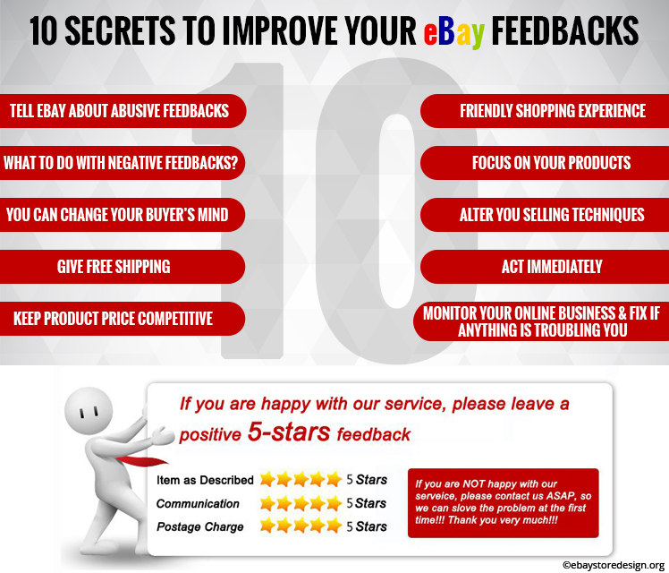
#2 What to do with negative feedbacks?
No worries, yes absolutely no worries at all. Negative feedback is not an end. You can improve them. Apologies for any delay or mistakes if committed from your side publicly.
When buyers will read negative feedbacks they will also scroll through the explanation posted by you. In this way you can neutralize your threat.
#3 You can change your buyer’s mind
Yes, even after they give negative one. You just need to satisfy your buyer by solving their product related problem or queries. Once they are convinced they will definitely leave a positive comment.
#4 Give FREE Shipping
FREE is a magical word & helps to fetch positive ratings. On the contrary you are not on a losing end. Due to bulk shipping your cost is not going to vary if you opt for free shipping
#5 Keep Product Price Competitive
If your product price aren’t competitive then your buyer will 100% go to your competitor. Hence price is a matter of big concern. Use eBay price recommendations while listing products.
#6 Friendly Shopping Experience
Provide your buyer with a hassle free checkout process. Lengthy checkout processes tend to flee buyers without any feedback & product purchase.
#7 Focus on your Products
Make changes in your inventory avoid broken or inferior goods because they will trouble your buyers & ultimately your business giving you tons of negative feedbacks.
#8 Alter you selling techniques
If you have recently experienced bad sales that gave you negative ratings then it’s time for some quick, easy & affordable sales. They will fetch you positive feedbacks. Try it now.
#9 Act immediately
Don’t leave buyer’s query, questions, and remarks about your product unheard. Act swiftly on them. Ask them to contact you before leaving negative comments. And this time give your best to serve the buyer.
#10 Monitor your online business & fix if anything is troubling you
Success in online sales comes through streamlining your entire business. Get everything in process starting from your listings till the delivery of your products. Monitor all these processes in person. Don’t leave things to get better with time.
Be patient with your buyers even in hard times. Only serving them better will keep your business rolling online or else you may have to shut down very soon.
If you have a long list of negative feedbacks then contact our expert team. They will show you how to turn them down with custom eBay listing solutions.
Get a FREE quote for any of our eBay Store Front Design Services.
We deal in a wide variety of innovative online marketing & designing solutions. Contact us or drop your contact details to get interesting info about our custom eBay listing solutions.
- « Previous Page
- 1
- 2
- 3
- 4
- 5
- 6
- ...
- 13
- Next Page »


