There are enormous designing service providers online with intelligent tools to craft a magnificent design out of traditional ones. So, what exactly you should look for into these designs? In other words, apart from being attractive, these custom eBay storefront design must be smart enough to give you back end support.
Let’s get on to the list of 8 elements that must be present in your eBay designs.
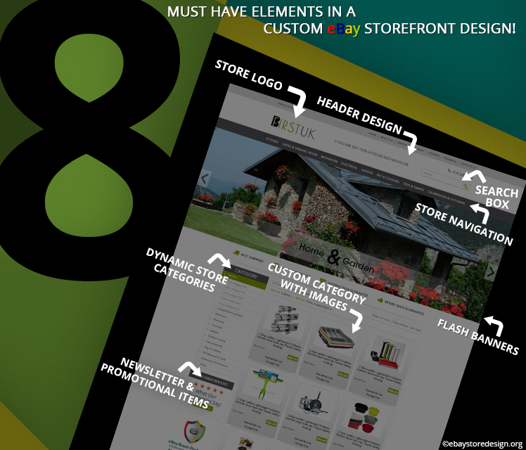
#1 Header Design
The header is the first cut what a visitor gets upon arriving on your storefront. It gives the idea of what products you are selling. A smart header design includes a logo, social media links, email links & contact numbers.
The logo remains in the top and other links are generally at the top or bottom.
#2 Store LOGO
A well-defined logo speaks everything about your business. It should be creatively crafted with the smart combination of fonts, colors, symbols, illustrations etc. you can go for a simple logo design too, but that is a risky job.
Many times simple design turns out to be nonperforming and on the other hand it may get you notify amongst your customers in a short time.
#3 Search Box
This is yet another inevitable supply on eBay designs. the search must be based on the product name or category. If your store search box is not integrated, the buyer will hint the trouble and go away.
#4 Store Navigation
Keep this short and simple. Do not tag each and every link on the store navigation bar. Only important page links shall be posted like Home, About us, Services, Portfolio, FAQ & Contact us. Other links shall be either on top or bottom.
#5 Flash Banners
Images are vital to any designs. Rotating banners up to 3 or 5 images are generally used. Many designers use up to 7 images in banners. The whole concept of banner images depends on the design as a whole.
Do put some taglines on the images related to your product to help visitors understand more. Offers & promotional text can also be added in the flash banners.
#6 Dynamic Store Categories
A custom design eBay store allows you to alter the categories. The word dynamic lessens the manual work in the product category section. It allows you to add eBay store categories on the listing templates. The latest updated category is displayed.
If the listing template is a static HTML page then it will not auto-update.
#7 Custom Category with Images
This works as a display shelf for the sellers where they tag a product image with its description, price, shipping info etc. gradually taking a buyer to the consecutive pages when they click. A brief intro of your product in the custom category with image pushes the visitor to grab more info about the product.
Many sellers follow this trend.
#8 Newsletter & Promotional Items
It is an ideal practice to keep a small amount of space on the homepage for offers, promotional material display, news, updates etc. This space can be utilized to put a small subscription form for monthly newsletters. Generally, these items are seen on the left panel.
A beautiful design with these intelligent features contributes on a large scale to the sellers.
If you need a custom design then get in touch with us today. Call us on +44 207 871 9932 and get free quotes on any design projects. You can directly chat with our expert teams.
Read & order one for your eBay store too!
Store designs are an integral part of store promotion & branding. They help you in attracting buyers and increase sales eventually. If you are reading this that means you are in a desperate need of increasing your store revenue. Now that you are here let’s see how we can do it.
# Go Mobile
Your Custom eBay store must be highly compatible:
- You listing design shall be such that it should adapt any screen size on which it is loaded.
- Try & use large fonts with bigger CTA button either on top or at the bottom.
- Run test analysis of your store & listing design to see where you find problems.
- Test your design across multiple sales platforms & browsers.
 Mobile is the next generation of sales hence, concentrate on it!
Mobile shopping has increased today and buyers have started using their smartphone frequently more than before. All multi sales eCommerce channels have reported a massive increase in mobile sales in the last quarter of 2015 i.e. 60%. More than $2 billion of mobile sales have been reported by premium eCommerce giants which is far more than desktop sales.
Well, what possibly would drive buyers to shop more from Mobile?
- People spend more time on tech gadgets like smart phones rather than TV. This has increased their buying habits.
- Shopping on mobile is comfortable; buyer can buy anything anytime from anywhere.
- Sellers have become more attentive, they have installed intelligent designs that can be accessed on mobile, tablet, laptop & desktop.
- Retailers attract buyers to shop from mobiles by offering discounts, coupons, free delivery, cash back etc.
- Buyers feel hassle free shopping on smart phones with free apps and easy available software.
What is the basic assumption of an average eBay Seller?
An average eBay seller assumes that his listings will be easily accessed across all screen size. If even he learns about the loading problem he/she will spend extra bucks to design completely new store/listings that will be mobile friendly.
That means extra cost for designing an entire new store. It’s very easy to test whether your eBay listing template is optimized or not, just access your store from a smartphone and see for yourself.
You can contact us for a fully custom made eBay store. These optimized designs lay a great impact on buyers & overall returns of your store.
Get FREE quotes on custom eBay store designs
This information was brought to your knowledge by ebaystoredesign.org team dealing in wide array of online marketing & designing solutions. Contact us to get custom eBay store designs and mobile responsive listing template for rock solid sales on eBay.
Select the listing format that is best for your product & starting making sales online!
How to list your product is the heart & art of selling on eBay. In this blog we have defined auction style & fixed price listing formats. Read them and see which is best suitable for your product.

Auction Style Listing Format
In this style of listing you get bids from the bidders & the one who bids the highest takes away the products. It can be for 3, 5, 7 or 10 days.
In auction style listing you can also integrate a buy it now tag price so that buyers can buy them immediately without waiting or bidding. The price may differ in buy it now option.
Auction style listing is preferred when. . . .
- You don’t know the price of the product
- You have rare items to sell like historic collections
- You are selling products that has no fix value
Fixed Price Listing Format
Fixed price is setting a steady price for your products so that buyers buy them quickly. Fixed price listing format allows 30 days product listing time period.
Fixed Price listing format is preferred when. . . .
- You have multi products, so that you can group them into one
- You know the exact price of the product
- You don’t deal in products having fluctuating price
- You want to list items for more than 10 days
- Your product inventory is big
If you are dealing in common products that are available everywhere online then fixed price is the best listing format for you. But keep the price low compared to others offering the same product.
Get in touch with us because we offer super affordable custom eBay listing solutions.
Get FREE quote for any of our eBay Storefront Design Services.
We at ebaystoredesig.org deal in a wide variety of innovative online marketing & designing solutions. Contact us or drop your contact details to get interesting info about our custom eBay listing solutions.
A product with beautiful image will undoubtedly bring in good amount of sales but provided the product is explained in equally descriptive manner. In this blog you will read about 7 tips that are easy to follow and believe us you will help yourself writing an informative product description that will bag good sales.
7 Tips to write a compelling Product Description:
Read the tips below before writing any of the product briefing for your store. It will take some time but at last it will be worth.
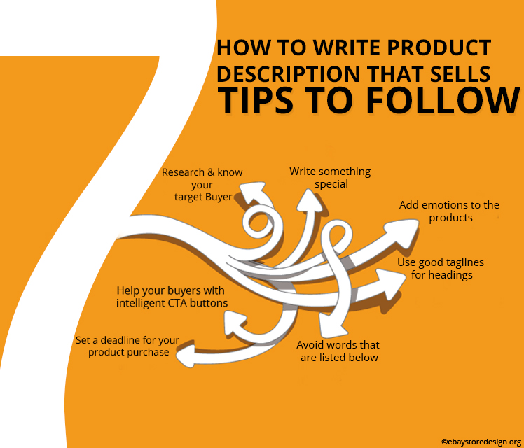
#1. Research & know your target Buyer
It is important to know who is or will buy from you. Whether he/she is a kid, a man, a woman or an aged individual. As a result doing this you will gather valuable information about your products to write for.
#2. Write something special
Make your product exclusive & special before your buyers. Pamper your buyers with a need of exclusivity and urgency both. Make your buyers feel important too. Everybody loves to be pampered.

#3. Add emotions to the products
Adding emotion to the product description always works, but in a better sense. Use words like secret, confidential, unbelievable, only for you, exclusive, ending soon, magical, remarkable etc.
#4. Use good taglines for headings
Buyers won’t read if they find it of no use. First understand the value of the product (not monetary) you intend to sell from a buyer’s point of view. This will help you to write a clear & concise description.
#5. Avoid words that are listed below
Fight, controversy, only we can do, we are the only one, forbidden, blacklisted, banned, hidden, explode, explosive, 100% guaranteed etc. these words are sensational but shall be handled carefully.
#6. Set a deadline for your product purchase
First create exclusiveness, give offers on the product purchase & then set a deadline to purchase the same on your description pages. Use words like ending soon, limited season sale, limited stock/pieces, last chance etc.
#7. Help your buyers with intelligent CTA buttons
After creating all kinds of eagerness, take your buyers to the next step that is buying. Use CTA buttons to do the same like Ask us, buy now. See how it works, start your free trail, get discount coupons etc.
Keeping these simple tips in mind you can write a fair enough product description that will push your sales.
We at ebaystoredesign.org design & deliver custom eBay storefront design that has all features to help a seller sell maximum at the end of the day. Contact our expert team if you want a custom design.
Contact us & get FREE quotes on custom eBay storefront design.
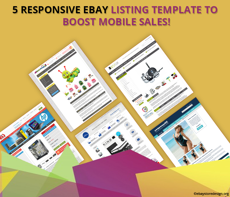
We all know the importance of mobile responsive eBay designs in today’s eCommerce industry. In order to over the competition & provide our eBay sellers with a second medium to sell we present 5 super fabulous responsive eBay listing template designs that we crafted for our clients recently.
In this blog we have integrated all those 5 store links so that you can access them on any gadgets. Be it a laptop, desktop, tablet or a smartphone.
9 Benefits of our Responsive & Professional eBay Listing Templates:
- Modern Layout for smartphones
- Fastest Loading time
- Friendly Design with mobile screen
- Compatible with any device
- Cross Promotion Benefits
- High readability on mobile devices
- No Zooming
- Touch friendly Image Gallery
- No additional Apps required

Below we have listed the links of 5 mobile eBay stores. It is advised that kindly access them on smartphone devices to get optimum result.
#1 Store Name: All Kinda Things
Click here to see the store LIVE! http://www.ebay.com/itm/-/172107153111
#2 Store Name: BFIRST UK
Click here to see the store LIVE! http://www.ebay.com/itm/-/172104813412
#3 Store Name: EURO IT SOLUTION
Click here to see the store LIVE! http://www.ebay.com/itm/-/172105885790
#4 Store Name: Mobile Mattress
Click here to see the store LIVE! http://www.ebay.com/itm/-/172115665360
#5 Store Name: Swim Wear OZ
Click here to see the store LIVE! http://www.ebay.com/itm/-/172112842760
Get FREE quote today for a super fantastic eBay mobile responsive eBay listing template.
This information was brought to your knowledge by ebaystoredesign.org team dealing in wide array of online marketing & designing solutions. Contact us to get custom eBay store designs and mobile responsive listing template for rock solid sales on eBay.
- « Previous Page
- 1
- ...
- 3
- 4
- 5
- 6
- 7
- ...
- 13
- Next Page »


