Selling on eBay matters psychology too, you need to grab more attention of the buyer towards many important factors apart from product. Indeed product is the king but the king too needs support of his alternatives.
Well then today let’s talk about a super fantastic custom eBay store designs of our client Mark Lewis. He is an artist from heart & soul and loves doing art work. We used sharp angles in the design to represent the art canvas on which the beautiful art work is crafted. The same angles we integrated in the left panel category box, store banner, product display space & many more.
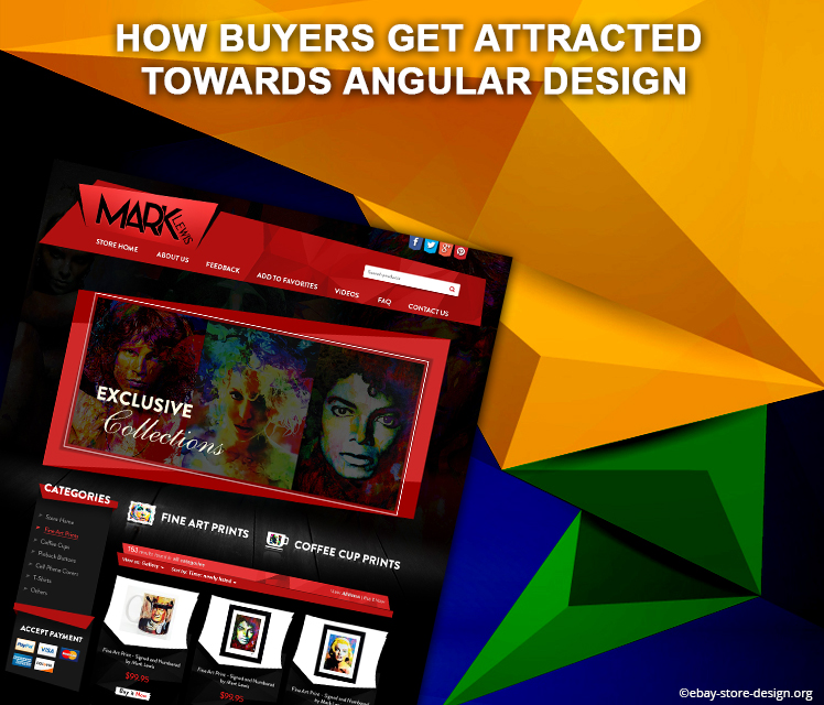
When buyer visits the store they find different angles moving their eyes around the store which gives them a distinct angular vision.
In this angular design we blended the perfect mixture of red color on black canvas after all it’s the store of an artist, so we decided to present this store in the most artistic manner.
Just beneath the banner we included “Fine art prints” & “Coffee Cup Prints” sections to facilitate buyers & tempt them to click & explore what Mark is offering them.
Trust tags in the footer sections are neatly placed without giving any distraction to the overall design.
If you are an art admirer then visit Mark Lewis store & if you are in search of an exclusive angular design that will grab more attention of the buyer than contact us. we will be happy to design your store.
Get FREE quote today.
This information was brought to your knowledge by ebaystoredesign.org team dealing in wide array of online marketing & designing solutions. Contact us to get custom eBay store designs and mobile responsive listing template for rock solid sales on eBay.
Every aspiring eBay seller had or will have a run down with a designer who promises to design & deliver a brilliant design but eventually end up making a big mess.
Although you are not an expert but still you can distinguish between good & a bad design. They promise to help you succeed online with their designs, but instead you make a crash land with a hefty design invoice in your hand.
You have gone through a lot – Time, Money, emotional turmoil, High sales dream, big seller reputation etc. & suddenly you have start over again.
Well, our expert team has brought up some interesting secrets that your designers won’t tell you, & if you know them before hand you can save you lot of time & money.
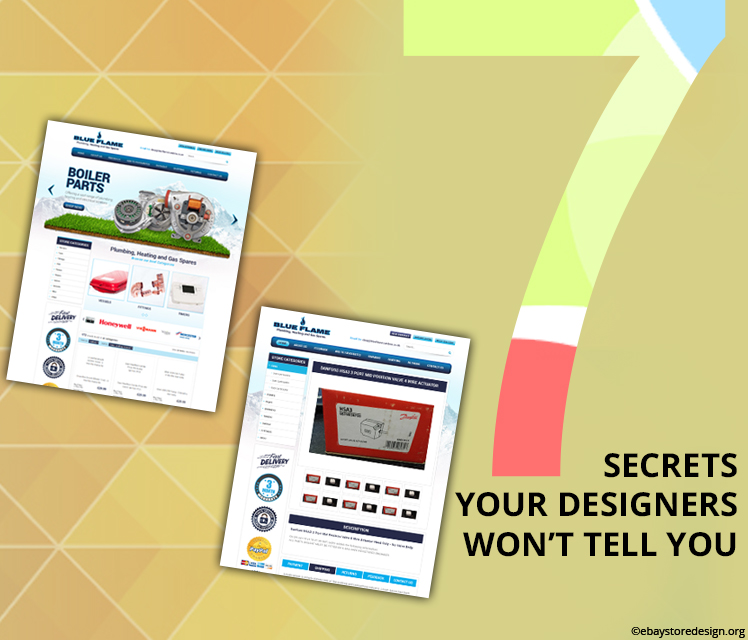
Secret #1: Good looks bring in sales, but not everytime.
Yes, you want your eBay store front design to look ravishing & visually great but good looks doesn’t work all time. If they say you great looking designs will fetch you more sales then ask them how.
If you get a beautiful design & desired sales figures than it is well & good, but if have to make choice between these two then go for getting results, because you are on eBay to sell & not in a beauty contest where looks matter the most.
Secret #2: They say you need a Redesign
What happens when you say your sales are down? They will immediately advice you for a redesign even if you don’t need one. They are just eying on big dollars.
There are many reasons for sales being down like – your content needs to be rewritten, your brand image may be pulling wrong target market, you may need a revitalising marketing strategy on the hole or even there may be an issue with your product or service.
Then why redesign?
Well you will be surprised if we say there is nothing wrong with your design. Just a recheck on your existing marketing strategy will do all you need to grow your sales. Hurrah! You saved a lot of money.
Secret #3: You don’t need to invest your life time savings
A good eBay store front design want cost a fortune. We don’t do it. Draft a budget & find a designer/s who can work within that budget. Yes, it’s easy to find one.
Many designer/s give free quotes ask for it & compare with your budget. This will save a big amount of money. Don’t jump in the run down, take your time.
Secret #4: Maintenance Charges or Monthly Subscription
eBay shop designs are usually a onetime expense, amateurish designers or individuals try such kind of unethical business practices. They bill you every month for maintenance or subscription charges which is totally a hoax.
Maintenance? What the hell is maintenance? Are you purchasing a studio apartment so you have to pay maintenance charges? Even they spare the residents.
There is absolutely nothing like maintenance, so don’t even entertain such designers who ask for the same. Simply say NO.
Secret #5: An out of the Box design
On the way to stand out & look different online your eBay shop designs end up being vague. We don’t deny the fact to have an out of the box design, infact we too design & deliver the same. But sometimes designing out of the box you completely go out of recognition & lose your brand identity. So, handle the “out of box” carefully.
Secret #6: Branding is not a cup of tea for all designers.
Branding requires specialization & is done with utmost expertise. They might be brilliant in designing, but not in branding. They are just assuming, they are not sure shot on this & you better know the meaning of assumption.
Hence, hire a brand specialist. Don’t waste your time teaching others how to brand your products.
Secret #7: Psychology of Designing
It is an art, not just Photoshop. It’s about how you want your buyer to behave when they visit your store. Where you want them to click & what will fetch them their desired products or services.
Best designers know the buyers psychology & shopping patterns. They know how to influence buyers & sell more. But wait, did they tell you about this? NO. Then search for a good designer who will build great stores that hold buyers for a long time & brings you sales.
If you gone through any of the one or more listed above then contact us. We will help to repair your loss.
Logo is your company’s identity element. A bitted apple resembles a giant smartphone company where a small tick mark is a big sport gear brand. Yes we are talking about Apple & Nike. What makes them common – it is their brand logo which helps buyers to identify them easily.
Read an informative insight into 9 things that we follow while we design a logo.
We have expert graphic designer or to say logo designers who delivers exclusive custom logo design services. The reason behind our logo designers being unique is they follow a stringent policy when they take any of the logo design task in hand. You will read this in the following infographic presentation brought to you buy collective efforts of our brilliant logo designers. Read them & know their secrets.
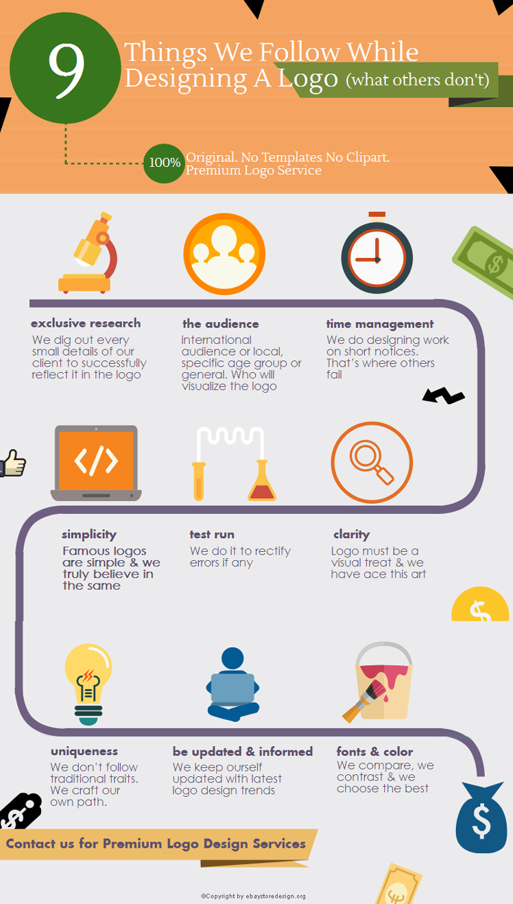
We deliver 100% original custom logo design services. We don’t use templates or clipart. Contact us for a premium & unique logo.
If you have any query regarding our custom logo design services for website or web store then contact us. Feel free to get in touch with us for an exclusive 10% OFF on your 1st eBay logo design. Get Free Quotes now!
This is your worst nightmare if you are in sales & you might have been in this situation once or may be twice. You contact a potential client & you see that things are going smooth. You regularly chat with your potential lead & then all of a sudden you get a dead silence.
You were upto the edge of cracking that sale& you almost had it, but now you are scratching your head &trying to make sense of what & where it went wrong. No worry, this happens to all of us sooner or later.To ease your confusion we have shared some important information on why the leads fail. This will help you figure out probable problems & help you stay ahead in future.
 First thing first is how you come to know that a lead is qualified & you can begin with it. Merely filling out a form or your lead asking you questions are not enough criteria for a lead to qualify. He/She may be a frequent visitor of your store or might have signed up for your newsletter.
There might be varied reasons for a lead that doesn’t convert. May be poor communications or they need more time. If they suddenly drop communication then you need to research & develop your follow up strategy.
Appoint someone else to handle the talks for a change or offer them some more personalized resources. This may change their mind. Give visual content, catalogues, videos, statistics etc. about your product or service.
If things don’t seem to work then it’s fine. Don’t panic. Give some space to the client, this will borrow some time. Keep regular follow up don’t give up. Read below for some interesting insight.
When your potential leads don’t respond...............
How did you come to know that a lead is qualified?
Probable Reasons................
- He/She is a frequent visitor of my site or store.
- They filled out my lead form on first hand.
- Signed up for my newsletter subscription
- They contacted me to ask question about my products/services.
What if you find the lead is not worth enough or unqualified?
Just leave it!Yes, don’t waste your time & energy behind them. Find out better & qualified leads.
Why leads didn’t convert?
They dropped the communication. Maybe you might too. Either they are not interested or they need some more time. Anything can be reasoned for a lead not converted.
Now what . . . . .
Evaluate your follow up strategy or elsetry new mediums to interact.
How to re-evaluate a follow up strategy?
Offer personalized resources relevant to your product or services. Don’t repeat the same you gave in the first meeting. Appoint another person to lead the lead. Show something different to influence their mind & decision. Make a fresh presentation if necessary.
Are they ready...................?
YES! Well done you turned a cold call into real cash.
NO! Give some space & try again. Don’t give-up! Remember it takes time make the potential client feel comfortable.
What’s your strategy to convert a cold lead? Contact us with your suggestion. You can also contact us for beautiful eBay store front design or specially customized eBay shop designs listing template designs.
Magento is an excellent eCommerce platform out there for aspiring ecommerce enthusiast & established business house both. With a brilliant magento ecommerce website you can provide your buyers a centralized shopping platform where they can find all of the items they need at a great price.
We are glad to share one such magento ecommerce web design of our client H Shisha created by our genius designing team.
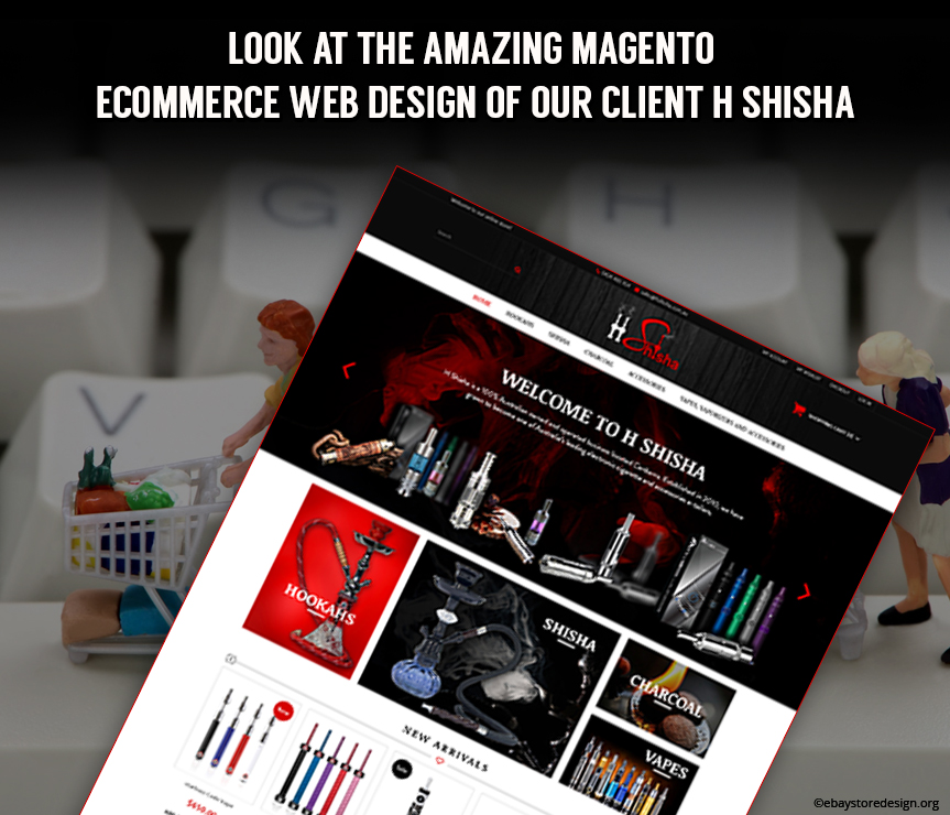
H Shisha Creates a Magical Spell with its magnificent color theme!
H Shisha deals in e-cigarette, hookah, e-liquids, flavored smoke papers & related accessories hence we drew the same hookah & smoke theme in the logo. With red & black colors integrated into the clickable areas like new arrivals, special products & header as well as footer sections to attract buyer’s attention. Special color theme aligned with products creates an environment for the buyers to move with the elements in the design.
This way the designing elements help seller to sell more products giving him/her maximum exposure which they might not get with standard website templates.
The new arrivals & special products features more sales because these sections showcase products that are fresh or for special purpose as the same suggests. The style of presentation is unique in these widgets.
Trust tags between new arrivals & special products widget is subtle & works to establish a professional trust in seller’s products & overall business credibility online.
Do you need a Fresh new Magento eCommerce Website? Request a FREE quote from our expert team.
Get a FREE quote now so that we can start your magento ecommerce web design instantly. Slip into our portfolio & have a look at our current work.
- « Previous Page
- 1
- ...
- 6
- 7
- 8
- 9
- 10
- ...
- 13
- Next Page »


