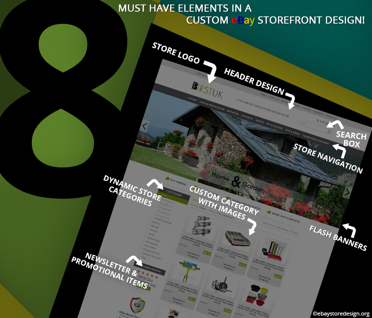
8 must have elements in a Custom eBay Storefront Design! Check whether you have them or not?

There are enormous designing service providers online with intelligent tools to craft a magnificent design out of traditional ones. So, what exactly you should look for into these designs? In other words, apart from being attractive, these custom eBay storefront design must be smart enough to give you back end support.

Let’s get on to the list of 8 elements that must be present in your eBay designs.

#1 Header Design

The header is the first cut what a visitor gets upon arriving on your storefront. It gives the idea of what products you are selling. A smart header design includes a logo, social media links, email links & contact numbers.

The logo remains in the top and other links are generally at the top or bottom.

Custom eBay Storefront design

#2 Store LOGO

A well-defined logo speaks everything about your business. It should be creatively crafted with the smart combination of fonts, colors, symbols, illustrations etc. you can go for a simple logo design too, but that is a risky job.

Many times simple design turns out to be nonperforming and on the other hand it may get you notify amongst your customers in a short time.

#3 Search Box

This is yet another inevitable supply on eBay designs. the search must be based on the product name or category. If your store search box is not integrated, the buyer will hint the trouble and go away.

#4 Store Navigation

Keep this short and simple. Do not tag each and every link on the store navigation bar. Only important page links shall be posted like Home, About us, Services, Portfolio, FAQ & Contact us. Other links shall be either on top or bottom.

#5 Flash Banners

Images are vital to any designs. Rotating banners up to 3 or 5 images are generally used. Many designers use up to 7 images in banners. The whole concept of banner images depends on the design as a whole.

Do put some taglines on the images related to your product to help visitors understand more. Offers & promotional text can also be added in the flash banners.

#6 Dynamic Store Categories

A custom design eBay store allows you to alter the categories. The word dynamic lessens the manual work in the product category section. It allows you to add eBay store categories on the listing templates. The latest updated category is displayed.

If the listing template is a static HTML page then it will not auto-update.

#7 Custom Category with Images

This works as a display shelf for the sellers where they tag a product image with its description, price, shipping info etc. gradually taking a buyer to the consecutive pages when they click. A brief intro of your product in the custom category with image pushes the visitor to grab more info about the product.

Many sellers follow this trend.

#8 Newsletter & Promotional Items

It is an ideal practice to keep a small amount of space on the homepage for offers, promotional material display, news, updates etc. This space can be utilized to put a small subscription form for monthly newsletters. Generally, these items are seen on the left panel.

A beautiful design with these intelligent features contributes on a large scale to the sellers.

If you need a custom design then get in touch with us today. Call us on +44 207 871 9932 and get free quotes on any design projects. You can directly chat with our expert teams.

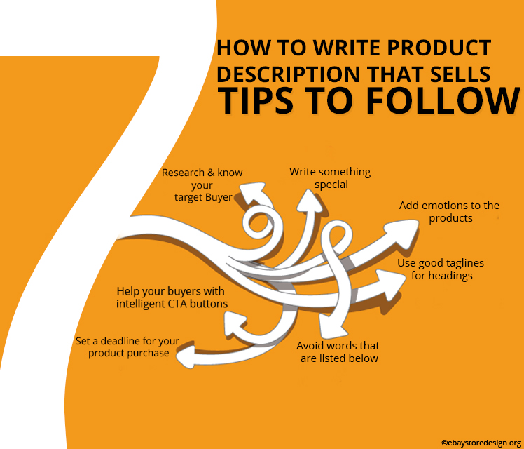
How to Write Product Description that Sells? 7 Tips to write compelling description that actually drags Buyers

A product with beautiful image will undoubtedly bring in good amount of sales but provided the product is explained in equally descriptive manner. In this blog you will read about 7 tips that are easy to follow and believe us you will help yourself writing an informative product description that will bag good sales.

7 Tips to write a compelling Product Description:

Read the tips below before writing any of the product briefing for your store. It will take some time but at last it will be worth.

#1.  Research & know your target Buyer

It is important to know who is or will buy from you. Whether he/she is a kid, a man, a woman or an aged individual. As a result doing this you will gather valuable information about your products to write for.

#2.  Write something special

Make your product exclusive & special before your buyers. Pamper your buyers with a need of exclusivity and urgency both. Make your buyers feel important too. Everybody loves to be pampered.

custom eBay storefront design

#3.  Add emotions to the products

Adding emotion to the product description always works, but in a better sense.  Use words like secret, confidential, unbelievable, only for you, exclusive, ending soon, magical, remarkable etc.

#4.  Use good taglines for headings

Buyers won’t read if they find it of no use. First understand the value of the product (not monetary) you intend to sell from a buyer’s point of view. This will help you to write a clear & concise description.

#5.  Avoid words that are listed below

Fight, controversy, only we can do, we are the only one, forbidden, blacklisted, banned, hidden, explode, explosive, 100% guaranteed etc. these words are sensational but shall be handled carefully.

#6.  Set a deadline for your product purchase

First create exclusiveness, give offers on the product purchase & then set a deadline to purchase the same on your description pages. Use words like ending soon, limited season sale, limited stock/pieces, last chance etc.

#7.  Help your buyers with intelligent CTA buttons

After creating all kinds of eagerness, take your buyers to the next step that is buying. Use CTA buttons to do the same like Ask us, buy now. See how it works, start your free trail, get discount coupons etc.

Keeping these simple tips in mind you can write a fair enough product description that will push your sales.

We at ebaystoredesign.org design & deliver custom eBay storefront design that has all features to help a seller sell maximum at the end of the day. Contact our expert team if you want a custom design.

Contact us & get FREE quotes on custom eBay storefront design.

12 Signs: Your Custom eBay Storefront Design can be a Disaster – The Conclusion

We have reached the final showdown of the blog series. We hope you will enjoy the conclusion & act accordingly. Treat your custom eBay storefront design as an asset to your store giving you healthy return on your investments. It is just a matter of serious design that yields good sales, leads & money at the end of the day. Read below the conclusion.
Custom eBay Storefront Design
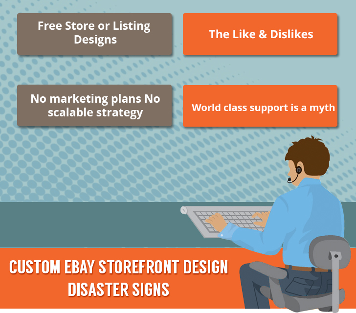
9) Free Store or Listing Designs

The word free is enough to attract anyone. Free design are available online they save your money doing harm to your business in a long run. Professionals do charge for their services but that is once in for all. You can take us as an example; we have no monthly subscription charges, or maintenance fees. You just have to pay once & that’s all.

New sellers fall prey to free templates & designs and land themselves in jeopardy.

10) The Like & Dislikes

Do you like your design? Before asking this to yourself ask this to your designer whether they like the product finished by them? Between all these likes & dislikes there is a key to the question that either your design will be a success or crash land.

Keep it simple. If you like your visitor will like if you don’t like then you know what to do with the design. Change the design or the designer.

11) No marketing plans No scalable strategy

The approach towards designing a custom eBay storefront design is loosely configured by everyone who is involved in the project. A good hand on photoshop doesn’t guarantee a good design. An amateur photshopper can do it for you if it is only colors & images.

Store designing needs a strategic planning immaterial of the project size. And by strategy we mean from initial consultation till final approval & installation of the design. Check with your service provider whether all the aspects are taken into consideration or not.

12) World class support is a myth

Don’t believe us? Pick up your phone & call a customer service center of any product purchased by you recently. Either they are busy or they will keep you waiting if luckily you got connected with them.

Busy phone line is not an issue, but every one of us has gone through the nightmare of long waiting calls at support service centers. The same situation is if you visit them personally. They keep you waiting. The actual problem is even after these long waiting periods your problem is not resolved.

An ideal support service must be quick, intelligent & easy. Not like transferring calls to different departments. Reputed service providers like us give liberty to our clients to directly chat with relevant individual who is responsible to solve the problem.

Concluding the four part series of the blog, carefully review the 12 points outlined here. This blog series will help you with a new perspective towards the digital world.

Set your business goals, hire right people, and gather resources that are needed to build your custom eBay storefront design. Think of your store design to generate leads & sales for you.

If you have missed the third part? Click here to read.

12 Signs: Your Custom eBay Storefront Design can be a Disaster – Part 3

If you are reading this then it seems that your so called custom eBay storefront design lacks something or else you are wise enough to study before going into actual designing process. Continue reading you are on the right track.

Custom eBay Storefront Design

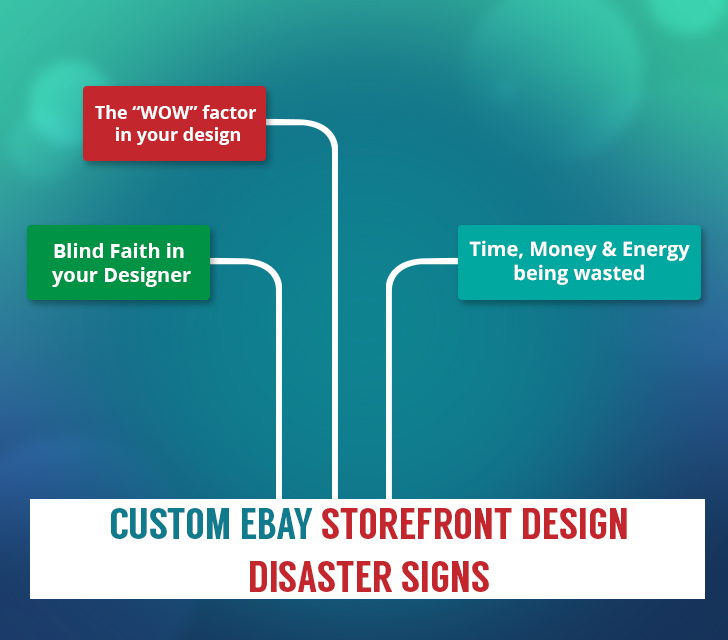
6) The “WOW” factor in your design

Every seller on eBay or any other eCommerce platform wants people to come and get amazed by the sheer awesomeness of the look & feel of your custom eBay storefront design. That is what we all call the “wow” factor.

Wait a second! In this wow factor mayhem you skip the basic consideration of the user – what they are expecting? & what they will experience when they come across your store?

It is really flashy to attract visitors with unwanted CTA buttons, pop ups, sparkling texts and so on. These things merely distract visitors; you are seriously mistaken if you think they surprise people. Infact these tactics will negatively impact visitor by slowing them down from accessing some really important areas of your store. Finally what happens, they fly away without even looking at your products or content they were here to see.

It must be your priority to provide the target audience what they need when they come to your store.

7) Blind Faith in your Designer

You don’t time, you either don’t have knowledge, and you hired less experienced designers or may be something else behind a disastrous design. Simply relying on the service provider will only lead you to a useless store or listing designs.

Infact it is very simple, do some research work online. There are tons of resources available on designing subjects in easy & understandable languages. These resources e often allow users with no knowledge of programming to learn the basics of the same.

8) Time, Money & Energy being wasted

A very substantial amount of time, money& energy are being wasted after updating current store designs with new one. And this goes on with every change in the platform provider from where you operate your store. The ultimate gainer is the service provider who earns from you, then who is the looser?

It’s YOU meanwhile your designer gives your store a so called decent, big facelift your sales are down. Buyers go away with a negative perception.

Solution is to go for modern method designs that keep pace with changing environment giving you less amount of expense on makeover or upgradation.

Follow us for the concluded fourth & the final part of this blog series. We hope you are enjoying this blog post brought to you by the excellent team of ebaystoredesign.org

Have you missed the second part? Click here to read.

12 Signs: Your Custom eBay Storefront Design can be a Disaster – Part 2

In continuation with the second part we would highlight here some important points same as in part 1 that may not seem to be as they are. Read here to check if you are on the right track or not.

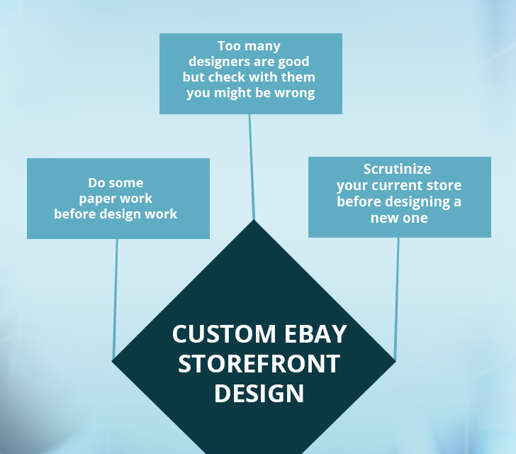
3) Too many designers are good but check with them you might be wrong

A team with expert people is good for your project, but at the same time you must consider who will be involved in the design process. It is important to know how much is too much. A bunch of professionals may come up with a brilliantly created custom eBay storefront design or else bring a project to a halt because everyone can’t come together on one decision.

A design must be a virtual salesman helping your buyers to buy desired products in time. They should speak to the needs of the buyer in a way that inspires buyer to purchase more from you. To create such an intelligent design you need to check upon the portfolio, staff & client reviews of the vendor offering design services.

An ideal person who is responsible for your store design will have to use your business goals, product summary & inputs while doing the design job. All these information matters a lot in store design rather than a big fat team of designers.

Custom eBay storefront Design

4) Do some paper work before design work

Don’t simply let things evolve – in simple words there should be a defined process of your custom eBay storefront design work & more importantly it should be in writing in the form of a contract. Go into a formal contract with your designer & that will bond both of you in terms of design expectations, pricing, timelines, revisions etc. Without defining these things might put you in a situation of never ending design mockups & unconcealed creativity.

Check with your store design service vendor whether they practice healthy paper work that is in the similar interest of both of you. A lot of disappointment can be restrained by defining certain things on paper before starting the actual work.

Reputable firms like us do the same with every project we deal with. This way you come to know who is doing what; unnecessary delays & confusion will be avoided. Paper work gives a flexible approach to the creative process.

5) Scrutinize your current store before designing a new one

You may be a frontline seller or a newbie, but gathering analytics for a new project is of crucial importance & this is applicable to both you & the one who is designing your store. Sellers pay less attention to this vital process & eventually spoil the essence of design.

Ordering a new design without observing loop holes in the current one will only lead to repeat the same problems. Hence, what is the ultimate solution?

Look for someone who can help you in this data analytic process – he/she can guide you on what to look for in the data. Ask your buyers what they want in a new design? Take their suggestions. Involve your friends & family members to review, compare both old & new designs on the scale of speed, performance, functions, user friendly etc.

Follow us for the third part of this blog series. We hope you are enjoying this blog post brought to you by the excellent team of ebaystoredesign.org.

Have you missed the first part? Click here to read.

12 Signs: Your Custom eBay Storefront Design can be a Disaster – Part 1

You are super excited about a custom eBay storefront design, and it’s very difficult to contain the excitement. There are so many things to put into place when you go for an eBay store front design immaterial of readymade or custom made. The basics remain the same.

Excitement may end up in a mess when you try to put together the resources, plans & lofty ideas into reality.

Lots of incoming advice from many sources like – who should do what, how long it will take, and how much it will cost etc. Finally, you’re lost & not sure where to start from.

Here are the 12 sign that your custom eBay storefront design is not on the right track and what can be done to avoid them.

Custom eBay Storefront Design
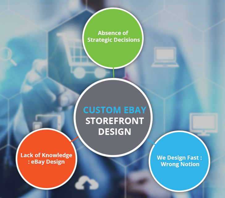
1) Absence of strategic decisions

Select, design, craft, create or order do anything but an eBay store front design must be based on your business goals. Not like your home interior designing project where everyone advices you on each & everything & you realize that something is wrong till decoration has gone wrong.

Providing strategic direction to the designer, your new design must be firmly rooted in driving your prime business objectives. Your design should be built to play an active role in your sales and marketing efforts rather than just being a fancy brochure.

Ask lot of questions to your designer or service provider. Set a deadline for this task so that your project is not off the track. Don’t forget to make tough calls cut unnecessary things from your wish list & add on some things that offer more value.

2) We Design Fast

Someone who is promising your design to deliver in 24 hours or luring to get it done in the fastest way is very much likely to give a poor result. Fake promises & over eagerness always lends you in tight situation.

The tight situation is on both the hand – the vendor as well as the client. He is dying to sell or make a design that is a complete waste of money & the later one is in dire need of a design.

Then what is the real procedure? An ideal designer will first examine your service or product wants & needs before any commitment. This kind of approach is realistic. Mutual discussions on designs, structure, layout, content, links etc. gives a good outcome. Hence, don’t fall prey to fake promises. If the designer is not interested in listening to you then how will he/she deliver what you want?

3) Lack of knowledge: How eBay designs are crafted?

Typically, there is an entire team of experts involved in engineering an excellent eBay design including web designers, web developers, analysts, programmers etc. job of a designer is to make the design look beautiful & a developer ensures that everything works in the way it is supposed to. Now if you hire a service provider who is good in one & not in the other one you may end up in a real mess.

OK, solution is to consider a team of professionals for the work who has the expertise to provide maximum value from both aspects that is delivery & the project budget.

We assume you are enjoying this interesting piece of information. For your convenience we have divided this blog into parts. This is the first part follow our blog post for the second one.