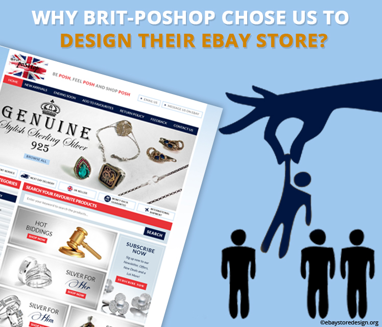
Brit-PoSHop deals in stylish sterling silver jewelry & was planning to get an unmatched eBay store design. Well, they could get the same with other designers too, but the why we?
Let’s check the reasons why Brit-PoSHop opted for us leaving the entire bandwagon of online store designers to design their eBay store.
You can go with ebaystoredesign.org for these reasons:
- Fleet of Experienced eBay store designers
- Unmatched & out of box designs
- Rich portfolio showcasing our current work
- Budget friendly quotes
- Truly responsive designs
- World class support services
- And many more things that are enough to opt for our services.

Our clients go with our designs, but what exactly we do that tempts our client to select us & not others. Let read.
The design
This particular design is crafted in British themed using red & white colors with navy blue splash all over it. As the seller is UK based.
The header section includes banner image with trust tags like Excellent Service, Next Day Delivery, UK Seller, Money Back Guarantee and International shipment.
The tagline
Above the banner image a solid tagline is added that says BE POSH, FEEL POSH AND SHOP POSH giving a rich feel to the buyer. All this collectively attracts buyers to the shop.
Left panel
Clickable store category is featuring only four items & that saves a lot of time of the buyer searching for products.
Why shop with Brit-PoSHop? is another reason for buyers to trust the seller. All these statements with icons are engineered to elevate the credibility of the seller.
In the main section
Instead of starting with product image description and price, we did something different. Our designer highlighted this area with HD image, attractive graphics & beautiful color theme. The result is we got “Hot biddings, Silver for him, silver for her & Featured silver”. Upon mouse over the image zoom for a click. A small red CTA button with “Shop Now” text helps buyers as to go where.
CTA button must serve the purpose of helping the buyers to move forward, the same we have done in this design.
A lot of white space is left so that the main product gets more highlight & not the design. This is also a reason for our client to go with our designs. We focus on the product so that seller gets more clicks.
We know we are best in designing and that we don’t need to show again and again in any client design.
If you are happy with this design we can make for you too. You can contact us for a similar one or more eccentric eBay shop with listing design.
Get FREE quotes on Custom eBay auction template!
Like us on Facebook, follow us on Twitter & Pinterest, Check out our google+ page. Along with good designs we also deliver informative blogs. Don’t forget to read them. You will enjoy it!


