6 Popular eBay Store Design Package our Clients love!

Find out what these packages offer.

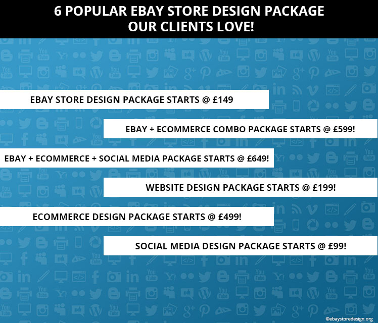
eBay Store Design Package Starts @ £149 integrating silver, platinum & gold package with 50% off. Now that’s an interesting deal. Click the link below & see what is included in the package.

Click here http://www.ebaystoredesign.org/ebay-store-design.html

eBay + eCommerce Combo Package Starts @ £599! You get a custom eBay storefront design in this package & promotion of the same on your eCommerce website. In simple words you get eBay store design + eCommerce website design in this price. Click the link below & see what is included in the package.

Click here http://www.ebaystoredesign.org/ebay-ecommerce-combo.html

eBay + eCommerce + Social Media Package Starts @ £649! It’s a triple benefit package including everything an online seller can dream of. The social media design includes facebook fan page design, twitter page design, youtube channel design & pinterest banner design. Click the link below & see what is included in the package.

Click here http://www.ebaystoredesign.org/ebay-ecommerce-socialmedia.html

Website Design Package starts @ £199! This package is a beautiful combination of static web designs from professional team of experts. We assure you that these kind of web designs will give you a strong online presence. Click the link below & see what is included in the package.

Click here http://www.ebaystoredesign.org/static-website.html

Only eCommerce Design Package starts @ £499! If you want to focus on only eCommerce then this package is ideal for you. The package delivers a wide variety of eCommerce solutions like play.com store design, magento website, opencart website, wordpress website, big commerce website & prestashop website.
6 Popular eBay Store Design Package our Clients love!

Get in touch with the designing team for more info.

Social media design package starts @ £99! What else you get from others in just £99. This package delivers overall social media solutions including facebook, twitter, youtube channel, pinterest, instagram, linked in & blog design.

Get in touch with the expert social media designing team for more info.

A beautiful eBay store does wonders for you as a seller. And integration of eCommerce & social media elevates your overall online presence.

Get FREE quote for any of our custom design Services.

We deal in a wide variety of innovative online marketing & designing solutions. Contact us or drop your contact details to get interesting info about our services.

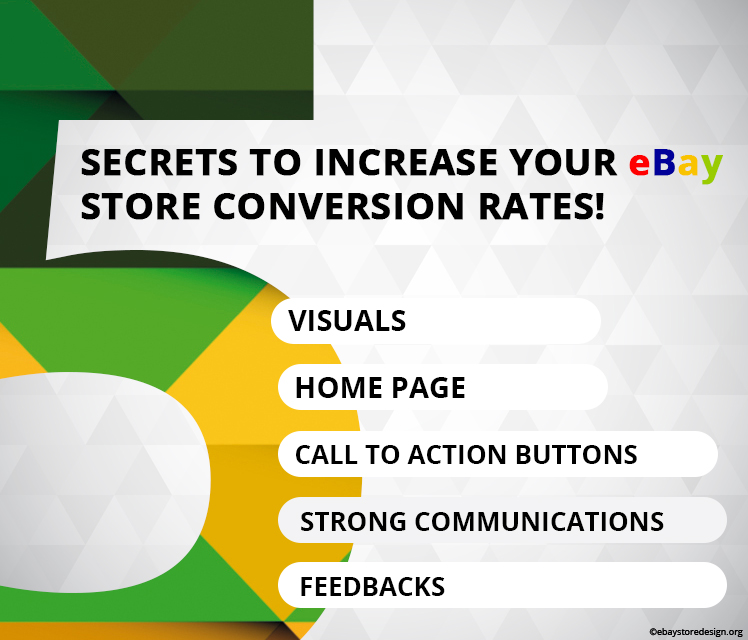
5 Secrets to Increase your eBay Store Conversion Rates!

In this blog you will read a brief story on very basics things that are often overlooked in your eBay store design. If they are well amended then you can increase your conversion rate to a great extent.

Let’s start with what they are & how they can improve your eBay store conversion ratio.
eBay Store Design

#1 Visuals

Visuals lay a big impact on your buyer’s retina. Visuals include images, design, layout, colors, banners etc. among these things colors play an important part. Read below how they psychologically affect buyer’s mind.

Females prefer blue, purple & green while males prefer blue, green & black. Hence when you do an eBay store design keep these colors in mind.

#2 Home Page

It is the first page of your store that a visitor will visit & you will be glad to know that you have only few seconds to convince them when they are at your store. Buyers at first instance only scan your home page or any other page, they just SCAN they don’t read. So, what’s the deal when they scan?

Your home page along with other pages must be attractive enough. They must be simple but attractive. Text must be concise, describe the benefits of your products instead of features, don’t waste their time or else they will run away quickly.

#3 Call to Action Buttons

The CTA button shall be smart enough to take your buyers to the next step. The CTA buttons are not for decoration purpose they shall actually serve the purpose of helping your buyers to take the right decision.

Place them in the header & footer sections; be specific while designing the CTA buttons. For example buy now, buy it, buy today, get discounts etc can be used.

#4 Strong Communications

Personal interaction with buyers has a good history of increasing sales overtime. Communicate effectively with buyers so that they come to know that they are dealing with real human beings on the other side.

Be clear & precise, keep a smile & be prepared with your conversation material.

#5 Feedbacks

A buyer before purchasing from you will always check for other buyer’s feedbacks, reviews or comments those who have already purchased from you. Reviews serve as personal recommendation to the buyers; hence always ask for feedbacks from your buyers.

If they post negative feedbacks, ask them why they did so. Solve their problems & try to gain positive feedbacks from the same buyer.

All these factors collectively work on buyer’s mind when they decide whether to purchase from you or not? And all these factors shall be integrated creatively in a custom eBay storefront design.

A beautifully crafted store design does a lot for you as a seller. These designs are easy to install, attractive & intelligent enough to generate leads & convert them into buyers.

Get FREE quote for any of our custom design Services.

We deal in a wide variety of innovative online marketing & designing solutions. Contact us or drop your contact details to get interesting info about our services.

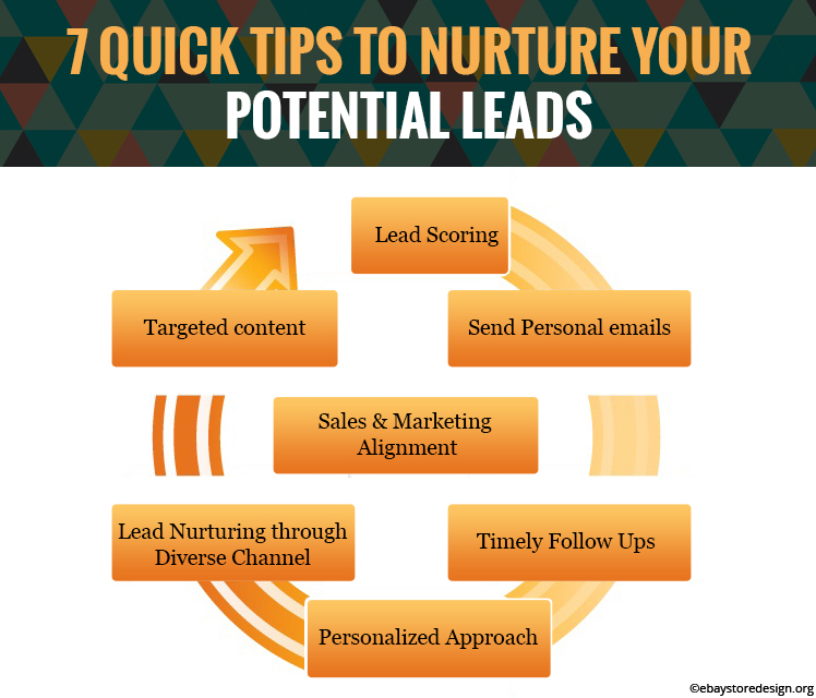
7 Quick Tips to Nurture Your Potential Leads

As you strategize a marketing technique to generate more leads, it becomes vital to pamper those potential leads who might convert into real-time buyers. If you approach 10 buyers there are chances that 1 out of 10 only will buy from you. That means 90% of your leads remain cold or either unconverted or untouched.

What can be done? The answer is to nurture them & you will see a big difference in your sales & that would make upto 50%.

Hence, in this blog we have written a brief introduction on 7 effective lead nurturing strategies that give a great opportunity to sellers like you to gain advantage & overcome competition. Read them below.

1) Targeted content

Nurturing leads with targeted content strategy is to deliver exact content to the exact person at the exact time. To do this first understand your buyer. What is his/her interest or objective to buy your product or service? See how your product/services will benefit him/her. Based on these data you can design your marketing content. This is what you say lead nurturing through targeted content.

eBay Template Design

2) Lead Nurturing through Diverse Channel

Gone are the days when email campaign was the only medium to communicate with potential buyers. Now we have the multi-channel technique to do the same. It integrates a combination of sending emails, social media interaction & engagement, highly decorated eBay template design to attract buyers, the stunning landing page of your eBay store design, direct sales etc.

3) Personalized Approach

Lead nurturing technique includes a personal approach towards potential buyer by addressing his/her questions & queries in person. That could be done by any means like phone, email, text messages etc.

Instead of sending your potential buyer a long list of shipping rates, taxes, price etc. send him/her an interactive calculator so that they can calculate the same by themselves.

4) Timely Follow Ups

A scheduled follow-up by an email or a phone call is the best practice to convert a lead into a real-time buyer. When you follow up a lead it shows that you are concerned about the buyer’s requirement. The same is reflected in buyer’s mind too. Hence, do it again & again.

5) Send Personal emails

Personalized emails tend to generate higher revenue compared to generic emails. Being personal is equal to being human. When you show a personal approach to your potential buyer they come to know that they are dealing with real humans and not any automated answering machines.

6) Lead Scoring

Though being an effective nurturing technique only 18% online sellers use it to contribute to their revenue generation. So, what exactly is lead scoring? Let’s understand it.

Lead scoring is a tactic to rank a particular buyer based on his/her level of interaction with your store pages or products they might chose to buy. In simple words, it is used to see what kind of visitor shows a certain level of engagement with pages, links, products, etc on your eBay store.

For this, you need to have an insight of your store pages like Facebook gives you.

7) Sales & Marketing Alignment

Both of them must be cohesive & well aligned to work & contribute towards revenue generation effectively accounting each other for converting a potential buyer into a real one. In short you will have to keep your sales team & marketing team conjoined to perform a task or track a lead.

Do you need more tips on nurturing your potential leads? Contact our expert team who design & deliver excellent eBay template design that is capable of generating & converting leads into buyers.

Get FREE quote today.

12 Signs: Your Custom eBay Storefront Design can be a Disaster – Part 1

You are super excited about a custom eBay storefront design, and it’s very difficult to contain the excitement. There are so many things to put into place when you go for an eBay store front design immaterial of readymade or custom made. The basics remain the same.

Excitement may end up in a mess when you try to put together the resources, plans & lofty ideas into reality.

Lots of incoming advice from many sources like – who should do what, how long it will take, and how much it will cost etc. Finally, you’re lost & not sure where to start from.

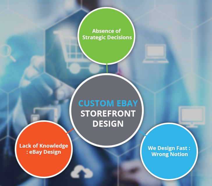
Here are the 12 sign that your custom eBay storefront design is not on the right track and what can be done to avoid them.

Custom eBay Storefront Design
1) Absence of strategic decisions

Select, design, craft, create or order do anything but an eBay store front design must be based on your business goals. Not like your home interior designing project where everyone advices you on each & everything & you realize that something is wrong till decoration has gone wrong.

Providing strategic direction to the designer, your new design must be firmly rooted in driving your prime business objectives. Your design should be built to play an active role in your sales and marketing efforts rather than just being a fancy brochure.

Ask lot of questions to your designer or service provider. Set a deadline for this task so that your project is not off the track. Don’t forget to make tough calls cut unnecessary things from your wish list & add on some things that offer more value.

2) We Design Fast

Someone who is promising your design to deliver in 24 hours or luring to get it done in the fastest way is very much likely to give a poor result. Fake promises & over eagerness always lends you in tight situation.

The tight situation is on both the hand – the vendor as well as the client. He is dying to sell or make a design that is a complete waste of money & the later one is in dire need of a design.

Then what is the real procedure? An ideal designer will first examine your service or product wants & needs before any commitment. This kind of approach is realistic. Mutual discussions on designs, structure, layout, content, links etc. gives a good outcome. Hence, don’t fall prey to fake promises. If the designer is not interested in listening to you then how will he/she deliver what you want?

3) Lack of knowledge: How eBay designs are crafted?

Typically, there is an entire team of experts involved in engineering an excellent eBay design including web designers, web developers, analysts, programmers etc. job of a designer is to make the design look beautiful & a developer ensures that everything works in the way it is supposed to. Now if you hire a service provider who is good in one & not in the other one you may end up in a real mess.

OK, solution is to consider a team of professionals for the work who has the expertise to provide maximum value from both aspects that is delivery & the project budget.

We assume you are enjoying this interesting piece of information. For your convenience we have divided this blog into parts. This is the first part follow our blog post for the second one.

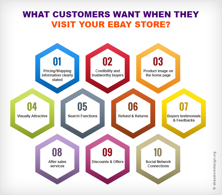
What customers want when they visit your eBay store?

Read below to know what a buyer or a visitor expects from you when he/she visits your eBay store. If you want to convert a guest visitor into a real time buyer you need to follow these simple guides.

custom eBay store Design

This way not only new buyer will get attracted, but you will get repeated business from old buyers too.

Here are some factors that decide whether a buyer will buy from you or not. These figures are derived from an online survey carried out by expert eBay template design team at ebaystoredesign.

1)    Pricing/Shipping information clearly stated

95.5% buyers want pricing and shipping info to be written clearly so that shipping and buying decisions can be made easily.

2)    Credibility and trustworthy buyers

70% buyers buy repeatedly or for first time from sellers whom they trust. They need to be secured from potential threats.

3)    Product image on the home page

76% buyers like to see product image that is displayed on the home page of your store. Product image on first look increases chances of buying. Is your custom eBay store design in such way, displaying product on the go?

4)    Visually Attractive

60% buyers make purchase when they find your custom eBay store design attractive enough. If not they will immediately switch over to your competitor.

5)    Search Functions

45% buyers will buy if they find search tools or search results satisfying. Search functions must be carefully integrated on eBay templates.

6)    Refund & Returns

59% buyers repeat orders due to friendly refund and return policies you practice. You can fetch positive feedbacks with this.

7)    Buyers testimonials & Feedbacks

65% buyers make purchase after reading others feedbacks. Testimonials and feedbacks help buyers making decisions.

8)    After sales services

35% buyers expect good treatment even after deal is closed. You ignorance can cost you heavily.

9)    Discounts & Offers

20% buyers eagerly await discounts and offers made by you on your store. They plan to buy in cheaper price.

10)  Social Network Connections

27% buyers see your overall approach and scan your brand online before making purchase. Buyers find social networks essential to make purchase.

Contact eBayStoreDesign for more info on beautiful eBay template design and or custom eBay store design, eBay listing template designs and online marketing projects.

Contact us for a free quote

eBay Seller Templates has a wide array of custom eBay store design to choose from on the site. Take a moment to browse our portfolio and request a free quote. Also, don’t forget to find us on Facebook, follow us on Twitter and check out our Google+ Page too!

Custom eBay Store Design for Humex Sterling Clearance Store

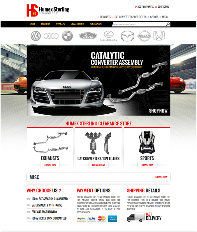
New eBay sellers are sales hungry while old ones are in the run to improve their brands online to get more recognition. Our client, Humex Sterling, an online auto parts dealer needed both – Good sales and brand recognition. Well, in the similar context we offered them such a design that the buyers when arrives on their store feels comfortable searching and buying products.

Custom EBay Store Design

Read the features of the design we offered to our client and how it worked for them.

The custom eBay store design for Humex Sterling clearance store is simple yet responsive

The category section is limited to only four and clearly mentioned in the header. This way left panel space is utilized to create more importance to the products. When buyer arrives at the store they grab the first look at the products which seller is offering without any distraction.

The vital ingredient of this design is the central area where the products are displayed with a high end CTA “Browse Now”. This will help buyer to explore more about the product offered.

It is seen that many eBay store design comes without call-to-action buttons. Well, in this way buyers cannot decide what he/she has to do next.

Brands are integral part of the business and shall be represented in a beautiful way as shown in this design.

Above the banner image famous & industry specific brand logos are highlighted which will reinstate trust factor of buyers in seller. This way conversion rate will increase getting more sales.

Feedback option helps buyer to compare and buy the product. 40% buyers read feedback before making a purchase.

In the bottom section feedback along with other links will do the same. Our design helped our client to rip dual benefit of increasing sales & fair enough share of brand visibility online.

At eBayStoreDesign we provide brand new custom eBay store design for leading auto parts sellers.

You can browse our portfolio to see out latest designing milestones for some of our esteemed clients. Don’t forget to find us on facebook & twitter.

You can also follow our blog to stay updated on new designing trendz.

Best Buy Movies Sales Custom eBay Store Design

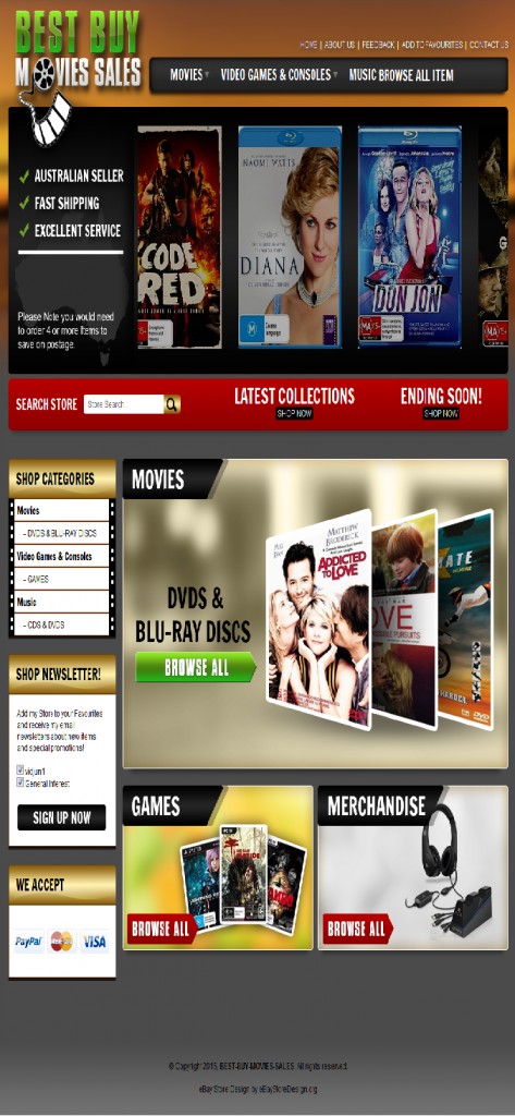
If you are planning to watch newly released movies in your upcoming weekend then it’s a fair deal to get latest movie from Best Buy Movies Sales. We were delighted to assist Best Buy Movies Sales with a custom eBay movie store design.

We helped them achieve their sales target and also helped them built a strong and regular buyer database.

It was quite simple with our custom eBay store design that we made for them. Instead of a movie poster in the banner images we kept recently released movie banner images with links so that whenever a new movie DVD is updated it will automatically be seen in these moving banners.

Custom EBay Store Design

Too much designing elements in header can spoil the browsing mood of the Buyer

Header of any design is the initial engagement point, hence keeping it simple and playful was fun. A Logo, default page links and category links will gradually kick the buyer’s attention.

The buyers can easily browse their desired products and navigate to other pages for more information about the company as well as the store.

Below the image banners search box is included with two CTA links “Latest Collection” & “Ending soon”. These links will tempt buyers’ eagerness to browse new movie collection or shop fast for movie DVD that are limited.

Clearly defined eBay Store Categories helps buyer to find their exact products

It is very important for a store to present exactly what buyers need. In this section three main category along with sub category are listed so that buyer clicks on the exact product category he/she wants. It makes the search fast.

These smart tactics enhances buyer’s buying experience and keeps them on the store for a long time.

A simple “Sign up now” button is sufficient without any designing elements distracting it.

New Movie DVD Products will keep Buyers coming back again & again

It is important to feature new products if you want your buyers to visit your store repeatedly. In this design we intended the same thing. A simple browse all link with recent movie poster is enough to show your buyers what’ new in the store.

Games & Merchandise options in this design give an opportunity to buyers to buy products other than main stream products. This feature shows that seller deals in multi products giving reason to browse more page of your custom eBay store.

Contact eBayStoreDesign today for a brand new custom eBay store for movie DVD sales.

You can browse our portfolio to see out latest designing milestones for some of our esteemed clients. Don’t forget to find us on facebook & twitter.

You can also follow our blog to stay updated on our new designing trendz.

eBay gives you same default Prehistoric Look – What about an Advance Custom eBay Store Design?

There are 1000s of online designing companies offering custom made templates or ready to use templates for eBay. Obviously custom made are highly advance with compatible features and ready use are equally advance but short of features.

Now if we care so much of these features then let me ask you what they are. What features shall an advance custom eBay store design posses? Ok let us discuss all the – what & what not’s.

Fully Customized eBay store designs

The design should be applied not only to the home page but to all store pages that are to be visited by your buyer. Designing few pages with a decorative home page due to what so ever reason will have negative impression. Give equal importance to all pages.

Unique Header Design

Your store design shall comprise of a standalone header design, so that the visitor gets a brief idea about product being sold. The header should be appealing enough to the buyer.

Designing Gears

Logo with an easy to remember tagline lays more impact on visitors and has the potentiality to convert visitors into buyers. But both must be a visual masterpiece.

Internal links placed on home page or other pages should divert visitors gracefully and his/her intention to click a link must be fulfilled.

Search Box

Any website or template design without a search box is incomplete and stands nowhere. Custom design must have search facility by product name, category, subcategory, type, size etc.

Images

Be it your home page banner or your products, image play an important role. Many designers give 4, 6 or 9 box space to place product images with a brief product info. This facilitates visitors the most.

Custom designs include beautiful banner images with crispy write ups. These tactics always works. An ideal custom design shall have these features.

Other Store Pages

Home page is the gateway of your store, but pages like about us, shipping, payments, returns, contacts us are equally important depending on the nature of the business and clients mindset regarding additional pages. They may differ.

Use of Charts & Tables

Generally charts and tables are used if you are selling consumer goods. Custom design displays size information country wise in eBay listing & store design.

Few of them go for distinct ways to display their goods other than charts & tables, but designing it may cost them.

Other Important Links

Contact us, newsletter subscription, sign in, sign up, social media links and others that are frequently used. Custom designs have special slots for these links. They are animated or place in a colorful background to divert visitor’s attention on them.

SEO Friendly

This feature is of utmost importance. The whole idea of online business is based on these techniques. In a custom store design the HTML codes are optimized to rank higher in search engines. These customized and SEO friendly designs tend to sell more than regular designs.

Opening an eBay shop is just few clicks work but bespoke custom eBay shop requires expert designing skills.